Mr. Bazaar on Instagram!

COPYRIGHT © 2009 - 2012 BRIGHT.BAZAAR

Wednesday 31 March 2010

{Sophisticated Los Angeles Interior}

If I was in LA, this is where I would hang out. Cool and sophisticated, yet warm and welcoming. I love the industrial feel of the space. As for the statement lighting, wow, just wow! Who's coming for cocktails?!

Image: LA Times

{Interiors Inspiration: Eclectic Tabletop}

This table was created by Evette Rios's for Butoni as part of The Diffa Dining by Design Benefit (you can read more about that, here). The tabletop was designed to evoke Tuscany in the mid-1800's. For some reason it really resonated with me, perhaps it's the warming yellow and orange tones paired with the stunning, eclectic tablewares? Amazingly, the table was only $41 and the bottom of the table is covered with wisteria branches - so creative, which I also love! You can see more images, here.

Tuesday 30 March 2010

{The Edited Collection: Starburst Mirrors}

Starburst mirrors are an easy way to add a statement feature to many interior schemes, and they look best in hallways and living rooms.

The mix of the black wall and gold mirror is stunning. Another great example of gold working outside of the holiday season.

If mid-century design is your thing, then this 3-tier starburst mirror is perfect as it echoes the 1930's.

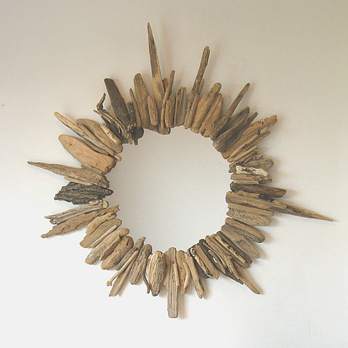
This alternative style starburst mirror caught my eye as I think it would be perfect for a garden room or beach house interior. Made from shards of driftwood in varying shades, colours and textures, it's a great way to add a tactile object to a room.

Perhaps this Fifties retro style is more your thing? I like the metal and mahogany combo, and can imagine teaming this with an ornate wallpaper for full effect.

Keeping a starburst mirror simple (like above) is best when you don't want it to be the dominating object within your scheme. There are plently to choose from and many start at great prices, like this one from Homebase for under £40.

This is my favourite of all the styles (which might be down to the excellent styling from the Graham and Green team)! Which one has got you reaching for the credit card?

{Stylish Photography Vignette}

I would love, love, love to have this gorgeous little print in my hallway; it would be the perfect tongue-in-cheek welcome for my guests and give them a taster of what I would aim to make my home feel like: A fun, playful and enjoyable place to be. Plus, what is it about vintage cameras that makes them look so stylish?! Such an easy thing to add to a vignette for instant style.

Monday 29 March 2010

{Oversized clock plays on expectations}

I'm loving how this huge clock really shouldn't work in this small Parisian cafe, yet amazingly, it does. I think the reason it works is down to the symetrical design choices; small lamps and equally sized bookcases either side anchor the scheme. Simple, graphic statements do work in small and cosy environments after all...

{Interiors Inspiration: New Mini Moderns Wallpaper}

Remember my post on Mini Moderns last year? Well the fab team of two are back with a new collection of whimsical wallpapers. The music-inspired collection features wallpapers designed with a soft psychedelic edge, and there will soon be coordinating cushions and a brand new mug collection. As for the wallpapers; they are available to buy now and I'm seriously tempted by both the harvest orange colourway of Pet Sounds (2) and the sheek yet playful design of C60 (4). Perhaps I should save up for both?! Which of the designs are your favourites?


Images (top to bottom): Pet Sounds, heather; Pets; Fayres; c60; Alice, blue - all Mini Moderns

Friday 26 March 2010

{Interiors Inspiration: Nautical Photography}

I've never been a fan of beach-themed bathroom accessories, but these prints from coastal interiors store Florestine are a totally different ball game. Modern, quirky, stylish and colourful, these photographs would be ideal for a bathroom, conservatory or even a garden room. My favourite is the fishing baskets (5) against the red building. Which one do you like best?


Images: Florestine

{Blog Love: Secrets of Domestic Bliss}

It's time for some Friday blog love and this week Secrets of Domestic Bliss is in the Bright.Bazaar spotlight! Authored by Ashlina, this blog is so much fun to read and is rammed to the rafters with inspiration. Ashlina posts mainly on home interiors, but there's the occasional fashion-related post as well, which breaks things up nicely (and trust me, this girl wears some fabulous outfits)! Anyhow, back to interiors; here's some of my favourite images from her blog.

Loving the polka dot pink cushion from H&M Home summer collection (1), plus the glitter balls add a touch of disco fever. The multi-coloured ottomans (2) are a super easy way to add a relaxed vibe to a chill out room or a playroom. I'm a huge fan of movie posters, so the stylish dining room (3) was an instant love of mine (plus, I'm loving the understated grey hues).

Earlier this week I posted a video about using frames to make statements on walls. The purple room (4) with coloured stripe prints is another example of how to achieve this great look. Breaking up the pattern of horizontal frames with portrait shapes stops the room looking too much like a showroom - a great decorating tip! As for the green door (6): Oh My Goodness, I am in love. It looks like it leads to a secret garden, or perhaps the secrets of domestic bliss? Either way, at least we have the secrets of domestic bliss blog for countless inspiration - thank you, Ashlina!


Images: Various sources, see secrets of domestic bliss for credits. If one of these images is yours and you would like it credited please email so I can add it onto the post.

Thursday 25 March 2010

{Colour Inspiration: Gold}

Often associated only with the holiday season, gold is actually a fantastic colour for adding opulence to interior spaces at anytime of the year. The vintage mirror (1) shows how to add drama to a hallway or bedroom (plus it's got that rustic French look to it that I simply adore). Over sized mirrors lent against a wall instead of mounted on it, always give an air of style and glamour; gold effortlessly adds to this look.

I'm loving how the gold pendant light (2) mirrors the bulbous wine glasses on the table. All it needs now is a good bottle of red to complete the look...! If you're looking to add a dose of instant luxury then add a few pieces of gold-coloured glassware (4) to your tabletop and your next dinner party will be fit for a king!


{Latest Collections: Zara Home's Colour Collection}

If there had ever been a collection created for the Bright.Bazaar blog, then Zara Home's Colour Collection would most certainly be it.


A vibrant mix of yellow, blue, green and pink gives the collection it's colourful theme. They've successfully managed to use all these colours using two key tricks: firstly by keeping the walls white and secondly by tying the varied colourways together with soft patterns in the pillowcases and duvet cover.


This tabletop set up is a delightful mix of florals and block colours. Having an ornate, heavily patterned tablecloth means the scheme needed balancing, and I'm glad they used block colours (in the form of glassware and cushions) otherwise there would have been too many patterns and colour clashes for me!

Images: Zara Home

All I have to say here is: When did carpet get so sexy again?! What are your thoughts on the latest collection from Zara Home?

Wednesday 24 March 2010

{Simon Sheeran: Colourful creations}

Simon Sheeran doesn't just make things, he makes lovely colourful things. Things that will make your home not only look but feel like a happy place; he's created additions for your home that to make living there a tactile experience. He's mixed colour, texture and a spoonful of fun to make some great homewares. My favourites are: the Dot and Doris wall decorations (1), which make me want to run my hand down the Smartie-like spheres; and the 100% recyclable (extra points for being green) Paper ball canopys (2), which are made through a handmade process of fixing together tightly spun paper balls.

{Video: Making the most of small spaces}

I've lived in many small spaces over the years and the one thing I've found each time is that a wall of mirrors and/or frames - all different styles, shapes and sizes - is a great way to add interest, colour and depth, without losing valuable floor space. This Today Show item on making the most of small spaces shows the value of decorating in this way.

Visit msnbc.com for breaking news, world news, and news about the economy

{Colour Inspiration: Purple Mannequin}

A simple shop mannequin. Painted purple. Funny how colour inspiration can come when you're not expecting it (thanks, ParisDailyPhoto). This colour would look fantastic as a statement in a bathroom; achieve this look by painting a freestanding bath in the bright purple hue, or tile one wall in the colour. If going for the later then I'd suggest doing tiling behind the bath or in the shower area as it will serve to frame the key pieces of the room.

Image: Eric Tenin

Tuesday 23 March 2010

{Marmite homeware: Love it or hate it?}

I love it on toast, but having the iconic Marmite logo gracing my kitchenwares...I'm not too sure. I definitely think these are fun to look at, and are certainly an easy way to add a pop of colour, but there's something a bit 'forced' about them. The splash of yellow on the handle of the Dualit toaster (below) is a nice touch, however I'm still hankering after the bright yellow one that was created to celebrate 100 years of Selfridges. Do you love or hate these Marmite-themed accessories?


Images: Marmite

Monday 22 March 2010

{Colour inspiration: Orange}

Orange is a great way to add zing to a room and can either be used extensively for a loud and vibrant look (image 1), or as a bold accent to lift an otherwise muted scheme (7). My favourite use of orange is the solid wall of orange tiles in the kitchen below (4); I think it's vibrancy would be wonderfully uplifting first thing, warming in the winter and suitably bright during the summer months. The berries (2) are a great example of how to use orange accents, whilst simultaneously maintaining a pretty and feminine scheme - this is often hard to do with such a masculine colour, so definitely use orange hues sparingly if this is the look you are after.

Friday 19 March 2010

{Colourful interiors advertising}


This advert is wonderful. I've got to give it to the ad agency, Leo Burnett who created the campaign because I would never usually think to go to Homebase for interior accessories. Now, however, I'm seriously tempted. I love how halfway through all the spaces come together and hundreds of different lights are illuminated. The colourful bridge is lots of fun too. It's a little like a stage set, just inside a train station instead of a theatre. Given the fantastic IKEA campaign running in Paris at the moment and now this work from Homebase, it seems there's plenty of interest around engaging consumers in the home sector. This is no bad thing; here's to more creative interiors advertising please!

{Brook Farm General Store}

This place is so lovely that I would like to move in. I don't care if it's a store and not a home, look how cosy it is! Plus, with stock that lovely why would I want to leave? The lovely guys from the Brook Farm General Store sum up their place brilliantly. So, in their own words, here's what they are all about:

Located just under the Williamsburg Bridge, in Brooklyn, NY, Brook Farm General Store is a modern general store offering a wide range of old and new items. From the most humble scrub brush to the most luxurious linen sheets, all of our products are useful, simple and timeless.

Useful, simple and timeless...I'm.In.Love. Happy Friday, everyone!


Images (top to bottom): Inside the store; Stainless Steel Straws; Anglepoise Original 1227; Wire Magazine Rack; Organic Goose - all Brook Farm General Store
Related Posts with Thumbnails
window.location.href="http://www.brightbazaarblog.com/";