Mr. Bazaar on Instagram!

COPYRIGHT © 2009 - 2012 BRIGHT.BAZAAR

Wednesday 31 October 2012

How To Add Character To A Kitchen

When decorating with colour it's important to consider texture and pattern alongside your choices of hue. Think about the elements of the space and what you wish to draw attention to (or try to disguise!) as the answers will help you formulate the vision for your space. In this kitchen we can see how a boldly patterned wallpaper has been used to visually 'open' the space by appearing to raise the height of the room. By papering the three adjacent walls to the galley-style kitchen, it effectively draws the rest of the space together, zoning it as the 'kitchen' and making it feel like a much larger space than it really is. The character and charm of the wooden floor boards are echoed in the rustic, weathered kitchen cabinets, which have been painted in a series of turquoise blue shades, then distressed. For me, this addition of colour and texture is what makes this kitchen is a real winner. What do you like about it, folks?
// Hus & Hem | Photography by Kent Bill Qvist

Tuesday 30 October 2012

Colour Palette: A Stylish Teenage Bedroom

I've had several emails recently asking for advice on how to decorate a teenager's bedroom in a manner that balances both fun and function without loosing any style points. This bedroom is a fine example of how to do this as it strikes a balance between feeling youthful and sophisticated. The benefit of this approach is that once the bedroom is freed up you will be able to swap out a few smaller pieces such as the lamp and the textiles in order to make the room a perfect spare bedroom. In the meantime, the playful stripes are tempered by the chic grey painted panelling, which is anchored by a black bed frame and rug. Choosing a metal bed frame allows teenagers to twist fairy lights around the headboard for a relaxed, younger feel, which again can easily be taken out for a more grown up look. Finally, incorporate plenty of storage into the room to make it practical for storing away DVDs, sports kit and so on.
// Ideal Home

Monday 29 October 2012

10 Things I Learned & Loved This Weekend

1. I had the most amazing time with IKEA in Sweden and experienced so many super things, which I'm really excited to blog for you!
2. I love how peaceful it feels when you are flying above the clouds.
3. The leaves are quickly becoming a beautiful shade of auburn.
4. Freshly made chocolate chip cookies look great in a Kilner jar.
5. These colourful rolling pins are one of my favourite pieces in the new West Elm Market collection.
6. How super sweet are these little scent diffuser milk bottles?
7. I learned how to make spider web style topping on my Halloween cupcakes.
8. Emily Isles makes colourful illustrative prints.
9. I would like to add this fair isle sweater to my collection!
10. I love the colourful buttoning on the Wilmot sofa.

Friday 26 October 2012

Using Colour To Soften An Industrial Kitchen Look

1 | 2 | 3 | 4 | 5 | 6 | 7 | 8 | 9
The fusion of industrial and country style has to be one of my favourite looks of the moment. I love the main colour combination of rich noir and racing green in this kitchen. Peppering primary blue and red accents throughout the space has helped to keep it feeling fresh and modern; a much needed hit of vibrancy to the industrial elements. The ticking stripe fabric that has been used to cover the front of the kitchen units adds a relaxed country charm, which in turn also softens the more robust elements of the scheme, such as the black walls and industrial-style metal stools. Sometimes I see a space that wholeheartedly encompasses my vision of Bright.Bazaar style, and this kitchen, with it's bold use of colour, is one of those spaces. Tell me, what are your favourite elements of this kitchen?
// Ideal Home | Photography by Simon Whitmore

Thursday 25 October 2012

Mr. Bazaar Is Off On An Adventure With...

...IKEA - For the next few days Mr.B is colour spotting in Sweden by indulging in all things IKEA-related. As always, I've packed my camera for this special trip, so just like the boat trip I took with them recently, you can expect a full round up of the adventure right here on Bright.Bazaar! While I'm away, I'll be sure to pop by the blog to ensure you still get your colour fix(!), and in the meantime I'll leave with these colourful and quintessentially IKEA spaces from their latest catalogue. Eeeep, I'm so excited!
// IKEA

Wednesday 24 October 2012

Dulux Colour Trend: Home Factory

The Industrial look has been enjoying something of a resurgence in interior design across the past few years, with many brands keying into the rustic appeal of the trend. Dulux are the latest brand to do just that as they celebrate industrial chic with their latest paint collection, Home Factory. The autumn/winter trend-led paint collection includes 16 hues from petrol blues and delicate teals to heritage brights and chalky neutrals, all of which will help bring warmth and colour to a utilitarian scheme. Mr. Bazaar's highlights include the wonderfully named, Raven Plume, an enveloping shade of navy blue, Citrus Grove (the yellow stool pictured above) and the refreshing Sea Urchin. Which of Dulux's new paint colours are catching your eye, friends? Do you have a space in mind in your own home where you might use one of them?
// Dulux

Tuesday 23 October 2012

How To Decorate With A Complementary Colour Palette

The best approach when combining two hues to make a colour statement is to pick from opposite sides of the colour wheel. This living room is a fine example of this decorating method: the teal blue walls paired with the burnt orange ceiling results in a striking yet balanced scheme. Notice how the main piece of furniture - the tufted couch - is in a slightly lighter shade of the teal walls, this prevents the piece from detracting or competing with the main statement of the room - the walls and ceiling. The strong colours of the scheme have been anchored with neutral textures, such as the jute rug and wooden table. For me, this shows how a well-executed colour scheme can breathe life into an otherwise formal and traditional space. Plus, the tufted couch is the definition of Divine, right?!
// House & Home | Photography by John Cullen

Monday 22 October 2012

10 Things I Learned & Loved This Weekend

1. I decided to pair my Cammeo Containers with this super fun carafe.
2. I love Gabrielle's stationery club idea - who wouldn't enjoy surprise paper delights each month?!
3. Treating myself to a Pain au Chocolate on Sunday morning.
4. Jimmy was such a great instructor at Jamie Oliver's cooking lesson on Friday night, where I learned how to cook Mexican street food with Rachie.
5. Making hot chocolate in my pastel milk pans on chilly evenings.
6. There's something incredibly cosy about these colourful foutas.
7. These velvet ribbons from Aura Home would be ideal for the approaching holiday season.
8. I love opening parcels at the best of times, but even more so when I find one of Schoolhouse Electric's yellow clocks inside!
9. I fell for Montana's pastel shelving unit.
10. I'm going to start saving up for this rug.

Sunday 21 October 2012

Sunday's Bright Links No. 96: Strung Lights

Elsewhere
This is the most convincing scrapwood-effect wallpaper I've seen to date.
Trust me, you'll want to watch this beautiful dinner party sneak peek video.
These free Halloween printables I found on Fellow Fellow are super stylish - yes, really!
Continuing the Halloween theme, check out this colourful take on the traditional pumpkin!
I'd quite like to live in this lake house, please.

Bright.Bazaar
How to combine yellow and pink to make a relaxing bathroom scheme.
// Photography by Will Taylor

Saturday 20 October 2012

Take Your Pick: Thornback & Peel Fabrics

Welcome to the weekend, friends! Apologies for not bringing you your daily colour fix yesterday but I was having technical issues with the site. Of course, to calm my technological-induced stress I sought out some Pin Therapy over on Pinterest. In doing so I discovered these beauties from Sofa.com; the shots show a range of the brand's pieces upholstered in Thornback and Peel's super fun Jellies and Cakes fabric: the Jethou armchair gets the mustard treatment, the Sunday armchair a splash of raspberry and the Saturday sofa is married with the cool grey colourway. Aren't they fabulous? Not only is the print unique and playful but the different colourways really bring each of the pieces to life. Being the Colour Addict that I am, I clearly love the mustard option the most. That said, the grey colourway is very sophisticated and looks great paired with the romantic shape and form of the Saturday sofa. Your weekend task? To pick your favourite colourway! Have a great one! x
// Sofa.com

Thursday 18 October 2012

Colour Cocktail: The Pumpkin Smash

1 | 2 | 3 | 4 | 5 | 6 | 7 | 8 | 9
As this year's All Hallows' Eve approaches, rumours are rife that there's a new cocktail in town that's set to tear up the town with its stylish sensibilities. Well, folks, it's true and the colour cocktail takes inspiration from the seasonal gourds of the moment. The Pumpkin Smash mixes up a refined palette of slate grey and gunmetal, with an added shot of spicy tangerine and pumpkin accents. For those who prefer their schemes on the calmer side, I would opt for a one shot version. However, for those who like to go all out on Halloween and in their decorating, you'll want to order the triple shot version of The Smash. The stronger cocktail is made by accenting the elegant and refined grey notes with a heady mix of pumpkin-hued pendants, accessories and textiles. One shot or triple shot, this cocktail hits the right note for the season by bringing a welcome warmth to the cooler days.
// Lifestyle photography by BH&G | Ferm Living

Wednesday 17 October 2012

Home Tour: Colourful Swedish Cottage

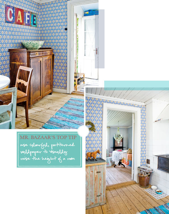
Bags packed, friends? Great, because today we're heading on a little Bright.Bazaar adventure to KolmÃ¥rden, Sweden where we are touring the Otterstrom family's weekend home. I loved posting about their colourful dining room last year, but I'm even more excited to be blogging other spaces from the same home, today. I like how the spaces have been decorated with colour in a bold yet refreshing way; the rooms feel vibrant and energising, yet serene and fresh at the same time. This is achieved by layering coloured accents against the scheme's milky white and cool grey base palettes. From multi-coloured dining chairs and mismatched textiles to coloured glassware and bold, graphic art, the spaces show how you can build colour into an otherwise simple scheme. Take the hallway as an example of this: the addition of three throw pillows, two cardboard storage boxes and one shoulder bag results in a memorable and colourful space that only adds to the impact of the open stairway, and, crucially, doesn't detract from the light and airy feeling encouraged by the grey and white backdrop. I think this approach has been repeated throughout the home to winning effect - a big thumbs up from Mr. Bazaar!
// Hus & Hem | Photography by Anna Leena Karlsson

Tuesday 16 October 2012

Colour Palette: Yellow & Pink Bathroom

Don't be deterred from strong hues when it comes to choosing colours for the bathroom; you can still create a relaxing space when combining colour opposites - just like the pink and yellow used in this bathroom. The key to using opposing colours and making it work in relaxing environment is to pick a softer shade of each colour. Using this bathroom as an example, we can see how depth is brought to the softness of the pale dusty pink walls through the addition of the yellow bathtub. By using a primrose yellow, as opposed to a brighter sunflower hue, the scheme is kept feeling refreshing and calm, but not bland or forgettable. Instead, the result is a space packed with personality, visual interest and gentle warmth.
// Catchpole & Rye

Monday 15 October 2012

10 Things I Learned & Loved This Weekend

1. I definitely know it's autumn when I get my fairisle jumpers out of storage!
2. I felt inspired by Kazuo Umezu's staircase that I saw in Sarah Bagner's new book Wonder Walls.
3. A cosy yellow throw is a must for cold, autumnal afternoons working on the couch.
4. I learned that I need to use more dough when baking bread in my new 'loaf' tin.
5. Pairing up my Jonathan Adler pillow with this cushion from Designers Guild worked a treat.
6. Starting a new notebook will always be one of life's simple pleasures.
7. Loved this cute and colourful little print.
8. Rifle Paper Co.'s celebration card made me smile.
9. Zara Home's Degrade mug is very pretty.
10. My kitchen would like to make friends with this tray.

Saturday 13 October 2012

Happy Weekend: Illustrator, Jayde Cardinalli

I always try to head into the weekend with a smile on my face, which is why I wanted to share these delightful illustrations by San Francisco Illustrator, Jayde Cardinalli, because, well, they make me smile. Scrap that; they make me beam with joy! I am utterly charmed by their whimsy and striking colour combination. I would love to hang all three of them in a row behind my couch - the colourings and style are spot on for my living room. I take a lot of inspiration from illustrations and talented artists and often find myself admiring illustrative work in magazines and books. Do you find this kind of artistic work inspiring? As for this weekend, I have a little baking and nesting planned. How about you, friends?
// Illustrations by Jayde A. Cardinalli
Related Posts with Thumbnails
window.location.href="http://www.brightbazaarblog.com/";