Mr. Bazaar on Instagram!

COPYRIGHT © 2009 - 2012 BRIGHT.BAZAAR
Showing posts with label Colour inspiration. Show all posts

Friday, 20 April 2012

Finding Colour Inspiration & Ideas

I get a lot of my colour inspiration from travel, as well as just walking around in the natural environment. I love to try and notice colourful little details that could otherwise pass me by in life. So, I headed over the the Laura Ashley blog to share some of my recent colour inspirations, both from travels and closer to home, as well as share some ideas for how you can find colour inspiration. In the post you will see some of my photographs from Italy, to Paris, to London and beyond! When I was in Paris I visited Merci and I spotted this paint splattered tabletop, which I fell in love with it at first sight. I'm thinking it's probably been a base for some serious creative happenings...! Isn't it great how the smallest little details can inspire us? You can click here to read the whole post for more of my snaps.
// Photography by Will Taylor

Tuesday, 7 February 2012

Spring's New Colour Palette

Lifestyle images scanned from Red, March 2012 and styled by Mary Norden, assisted by Sarah Keady | Photography by Polly Wreford
Products: Orange: throw, candle, table | Yellow: pendant, paint, bowl | Pink: lamp, chair, table
As the snow flurries fell peacefully (but very heavily!) in London last weekend, I let the Homes pages of the March Red magazine transport to me the sunshine filled days of spring. Their 'pretty modern' story demonstrated a variety of ways to combine bright hues of orange, yellow and pink. The key when combining these three colours is pick two 'hero' hues from the palette, mixing in the third sparingly to break the balance. This is seen above in the yellow vase on the dining table, breaking the pink and orange hues of the table cloth; or upon the orange Jonathan Adler chair where various shades of yellow throws are juxtaposed with a standalone pink cushion. This sunny palette is perfect for adding a lift to a pared back, modern space for the coming season. I liked it so much, I couldn't help but pick products to match the look from three high street stores. What's inspiring you about this shoot, friends?

Wednesday, 29 September 2010

Styling Inspiration: Elephant Props

Do you ever fall upon a blog, website or creative space and instantly it connects with your aesthetic? Well, this very experience happened to me when I turned the first page of Sweet Paul's fall issue, whose inside cover was dedicated to advertising Elephant Props, a full-service prop house in Manhattan's Chelsea neighbourhood. Ran by Michele, a former prop stylist, and Patrick, a former set designer and builder, you can just imagine the visual delights within their prop house. Discovering Elephant Props was as exciting as winning the golden ticket was for Charlie.

Thursday, 26 August 2010

{Orange}

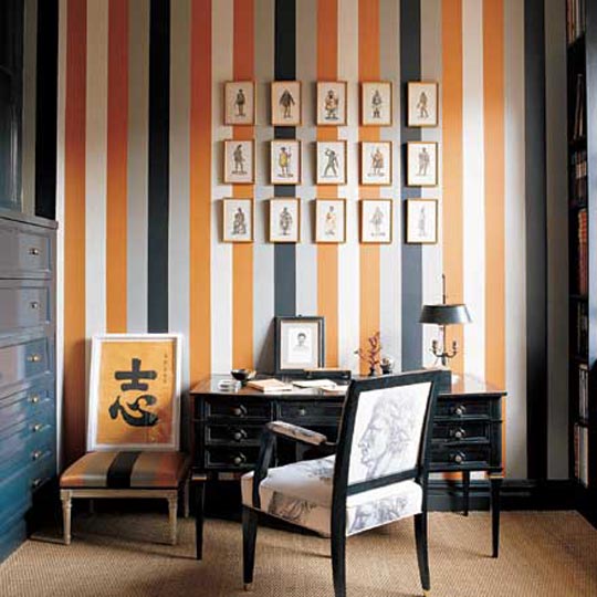
This Bright.Bazaar guy is craving a little dose of orange in his life. Ok, maybe a bit more than a little! So there's only one thing for it folks, a triple helping of The Bright Stuff. From burnt hues to poppy brights, this colour is one of my all time favourites (I blogged about it's zing back in March). Kicking things off is a little combo of stripes and orange (1) which gives that home office some serious masculine charm. For uplifting and happy spaces I like the lighter, brighter hues (2, 4), especially those dining chairs (7) and the striped bench (8) in the breakfast bar. It turns out orange looks pretty darn good in a stripe pattern. That said, they're all tempting spaces for me, but it would be wrong not to pick a favourite or two, right?! I say: give me the artwork from that grey living room (4) and those hot orange stools (9) and I think my cravings will be satisfied. For now, anyway...

1 | 2 | 3 | 4 | 5 | 6 | 7 | 8 | 9

Friday, 30 July 2010

{Colour Cocktail: Multi Coloured}

After all the lovely comments about my multi coloured striped armchair earlier in the week, I thought it would be fun to finish the week off with a multi coloured cocktail extravaganza! Not only have we seen Miss. Bradshaw embrace the style in her old apartment, but also this has to be one of the easiest ways to add a confident punch of colour to a scheme. There's no need to paint or wallpaper, rather, pick up a statement accessory in your favourite multi colourway and you've got yourself a fun and playful space in an instant. Just check this look out in action below; the upholstered sofa and rug complete each space without anything extraordinary going in the rest of the room's decor. I'd like to add some more of this style to my apartment with that Jonathan Alder 'Ties' cushion. Do you have any multi coloured accessories? How would you use this colour cocktail in a decor scheme?

1 | 2 | 3 | 4 | 5 | 6 | 7 | 8 | 9 | 10 | 11

Friday, 9 July 2010

{Colour Cocktail: Grey and Orange}

Oooo this is another of my fave colour combos. Grey is to orange like lemon is to Diet Coke - they just go together with such ease. When these two get together for a decor party you know you're onto a winner; the results of their matrimony are just so satisfying. These two can be make a simple, subtle yet stunning statement as seen in the dining room below; or can form part of a structured scheme as seen in the home office. I've posted that home office before, but I couldn't resist including it in this post as well because - I'm not gonna lie - I'm a little bit in love with it! Have you ever decorated with this statement duo of colours?
Images (left to right, from top): 1 | 2 | 3 | 4 | 5 | 6 | 7 | 8 | 9

Thursday, 8 July 2010

{A Fun First Home}

Can you believe that this bright, airy, friendly and colourful home is one of those identi-kit houses that are popping up left, right and centre? The UK is full of bland, expansive housing estates with seemingly never ending rabbit warren-like roads of identical homes, and the reality is for many first time buyers that these are affordable option. So, to see this space from a brand new 'cookie cutter' house in California has really inspired me. Why? Well, at risk of breaching the copyright of a phrase that could well be under copyright by Simon Cowell, Ellie and Ed have really made this place their own (!). Ellie is a talented wedding photographer and bought this place a year ago with her man, Ed. It's inspired me to think about the possibilities that a new build can offer for decorating. I love that two thirds wooden panelled wall (1) as well as the yellow chairs (obvs), plus they've devoted a whole four walls to my favourite stripes (2) and all the while their colour choices are bold, brave and dramatic (3,4). A welcoming mix of industrial touches, rustic textures, flea market finds and confident punches of colour. Yum. You can see the whole tour of their home, here.

Tuesday, 6 July 2010

{Green}

I've written before about my reluctance to decorate with green, and I've since decided to try and inspire myself into feeling warmer towards the colour, especially given its versatility and ability to set the mood of a whole scheme. To me, the green door (1) screams of a place that has a rustic charm that's also a friendly, welcoming environment, whereas the clashing animal patterns in lime and dark greens (2), and the bright lime hues of the dining table (5) are both examples that clearly state their owners' eccentric personalities and daring decor choices. These are all equally fab in different ways, but interestingly for me - given I normally gravitate to brights - when it comes to green, I'm all about the softer, darker and more moody hues, just like the tiles seen in the kitchen (9). How about you guys; which shades of green do you like?

1 | 2 | 3 | 4 | 5 | 6 | 7 | 8 | 9

Friday, 2 July 2010

{Colour Cocktail: Black and Gold}

I'm so pleased it's Friday, aren't you? I'm in the mood for a weekend of relaxation and a touch of indulgence. There's no decor scheme more perfect for this than black and gold - it's the ultimate in luxe glamour. I feel like diving onto that couch below, cracking out my favourite escapist movies (Devil Wears Prada, anyone?!) and tucking into all my favourite finger foods (olives, lots of them). From this week's colour cocktail picks I'm really drawn to the gold scratch vase, and that taxi pillow is certainly interesting; I see something new in it everytime I look at it. Do you have a favourite piece? Well, whatever you do this weekend guys I hope you have a lovely time. A very happy Canada Day to all my Canadian readers, and as for all you lovely stateside dudes and dudettes, enjoy your July 4th celebrations! See you on Monday. x

Images (left to right, from top): 1 | 2 | 3 | 4 | 5 | 6 | 7 | 8 | 9

Friday, 25 June 2010

{Colour Cocktail: Pink and Orange}

This week two of the world's pop colour heavy weights join forces to make a cocktail so strong it could blow the roof of the house off. Ok, not really, but these are two very bright and very determined colours. Pairing them up should spell disaster, but done right these two vibrant personalities don't clash. In fact, they get on pretty damn well. And anything that featured in Domino is our friend, right? Thought so! Thanks for another fun week, friends. Have a fantabulous weekend and I can't wait to see you back here on Monday. x

Images (from top, left to right): 1 | 2 | 3 | 4 | 5 | 6 | 7 | 8 | 9 | 10
Related Posts with Thumbnails
window.location.href="http://www.brightbazaarblog.com/";