Mr. Bazaar on Instagram!

COPYRIGHT © 2009 - 2012 BRIGHT.BAZAAR

Friday, 29 June 2012

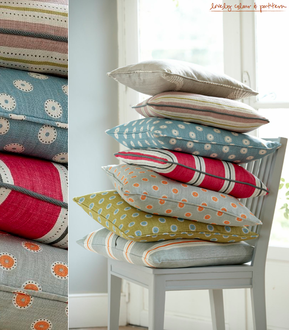
A Colourful Swedish Fabric Collection

Vanessa Arbuthnott's Swedish collection draws inspiration from some of the iconic British designers of the 1950's - but with a subtle Scandinavian twist. The four new designs depict stylised birds and foliage in new Gustavian shades such as Dove and Dusky Pink and some bright contemporary colours, Pumpkin and Sweet Pea with a spot and a striped design as co-ordinates. The Pretty Maids fabric in Duck Egg, Pumpkin and Winter colourway is hands down my favourite, but Stockholm Stripe in Sweet Pea and Winter is a close second. Congratulations to Vanessa on her 10th fabric collection: one full of wonderful colour and pattern. A big thumbs up from Mr. Bazaar!
// Vanessa Arbuthnott

Thursday, 28 June 2012

Colour Palette: Barcelona Tabletop

How do you fancy joining Mr. Bazaar for a little Mediterranean mezze today? After seeing this tabletop of pieces from John Lewis, I'm feeling inspired to pull together a relaxed lunch with friends, serving up light bites upon glazed terracotta ceramics in deep purples and zesty hues. Stripe linens nod to the colours seen in the serveware, whilst acacia wood serving boards adds texture to the affair. These are my favourite types of lunches: lingering, relaxed and packed with flavour and colour. What constitutes an ideal summer lunch and tabletop for you, folks?
// Edition | Photography by David Cleveland; Styled by Laura Fulmine

Wednesday, 27 June 2012

Store Tour: Mariska Meijers Amsterdam

Mariska Meijers, a creative tour-de-force based in Amsterdam, has recently opened her premier bricks and mortar store in the city and it's just as colourful and vibrant as her established online store. Located just between the Jordaan’s 9 Straatjes (9 Streets) and the Bloemenmarkt (or Flower Market), the creative aesthetic of artist and designer Mariska Meijers is a perfect fit for the area as it matches the eclectic attitude of the 9 Streets, and the colourful floral theme of the market. Be sure to stop by and shop Mariska’s original designs across a mix of home accessories and furniture, all complimented by an ever-evolving collection of art, antiques and vintage furniture. The traditional delft blue of Amsterdam had just gained another punch of hot pink and I for one am all the happier for it! What do you like about Mariska's store?
// Photography Marjo van Rooyen | Styling Ann Christine Hartman

Tuesday, 26 June 2012

Brilliantly Graphic & Colourful Bedding

Don't you just love how a simple change of bedding can totally change up the feel of a bedroom? I often swap mine out for different styles, especially as the seasons change. I'm also open to spending a little more on bedding than say, cushions, because we spend so much time in bed so it makes sense for me to invest in this area of my home. As for these designs by Aura Home, well they are ideal for adding a touch of graphic style to a bedroom. Try the purple chevron design as an accent to an emerald green scheme, or use the teal, purple, silver and ochre stripe design to add colour to a pared back space. Which patterns are catching your eye?
// Aura

Monday, 25 June 2012

10 Things I Learned & Loved This Weekend

1. I loved these beautifully planted flower beds in Regent's Park, made to look like the Union Jack flag.
2. Couldn't help up snap a picture of this nautical packaging!
3. These perfectly Bright.Bazaar tea towels found their way into my kitchen.
4. One day I will have a front door as playful and colourful as this studio in south London.
5. Fornata have great restaurant designers - loved the design of this place!
6. I was delighted to be included in an article within The Sunday Times about interiors and blogging.
7. Custom painted wooden forks are super fun!
8. This Dwell Studio shower curtain is one of the best I've seen this season.
9. Bought this pocket square ready for a wedding I'm going to in a few weeks.
10. Espadrilles covered in anchors = brilliant!

Friday, 22 June 2012

Colour Palette: Window Seat Colour

This space is a great example of how the introduction of colour and pattern can pull a space together. The wide stripe fabric off the window seat pad visually extends the window, pulling the eye into the corners, creating a feeling of space. It also serves to frame the window, making the view through it part of a feature in itself. Upon the floor, the patchwork-meets-kilim rug adds texture and pattern to an otherwise pared back space. Simple additions such as these are what make a scheme special, and I for one would love to relax here with a good book and a cup of fresh coffee!
// Photography by Felix Forest | Production Lucy Feagins / The Design Files.

Thursday, 21 June 2012

Designers Guild Jinshi Tabletop Collection

I literally gasped when I first set eyes on this new tabletop collection from Designers Guild. In an instant I felt transported to an exotic Greek isle, soaked in sunshine glittering upon azure blue waters and infinite clear blue skies. OK, so I like to dream but isn't that what homewares are meant to do: transport us to a place of comforting calm and indulgence? There's no denying my love for blue hues; my wardrobe is continually dominated by shades from an diverse collection of blue hues, as is my home. The Jinshi porcelain and Cobalt linen collections combine beautifully to create a summer tabletop that oozes magical Mediterranean style. The watercoloured brushstrokes add interest to the delicate blue lines, making it easy to mix and match pieces from across the range but also existing pieces as well. All that's left to do now is to throw a summer dinner party!
// Designers Guild

Wednesday, 20 June 2012

Stylist: Charlotte Love's Pretty Pastels

A few months ago I featured one of Charlotte Love's prints in a 10 Things I Learned & Loved This Weekend post but today I want to share one of her recent test shoots. As well as running an online shop, Charlotte is also a very talented interior stylist, whose work regularly catches my eye in the likes of Good Homes magazine and when assisting the lovely Selina Lake. I think she styled up this pastels story an absolute treat without going overboard and creating a sickly sweet result. Rather, the space feels fresh and organic, not overly forced. Charlotte has expertly paired sorbet hues together, breaking them with the occasional flash of neon - the key to creating a winning pastel scheme. The dip dyed curtain teamed with the baby blue hued wooden chair is such a delight! As we know, pastels are top of the class in both interiors and fashion right now so I hope this shoot sends lots of work Charlotte's way. What a talented, creative and inspiring woman!
// Styling by Charlotte Love | Photography by Jonathan Gooch

Tuesday, 19 June 2012

Take Your Pick: Colourful Hallway Stripes

OK, folks, here's a fun task to make Tuesday a little more bearable for you! Which of these two striped hallways do you like best? Do you opt for the olive green and dusty mauve wide split stripe design or the classic blue and white combination of the nautically themed second space? Whilst I like how both spaces have echoed their colours and stripe patterns in the runner rugs, I think the effect is more suited to the second space. That said, in the first space the bold azure blue within the artwork really lifts what are fairly muted colours, adding a dash of quirk to the scheme. However, on balance I'm just airing a little more on the side of the second hallway. I love the combination of red, white and blue and think the untreated exposed stairs adds just enough 'grit' to an otherwise safe and gentle scheme. Which takes your vote?
// 1. Living etc | 2. Living etc

Monday, 18 June 2012

10 Things I Learned & Loved This Weekend


1. Enjoyed spending a beautiful afternoon by the River Thames.
2. Kicked off the weekend in style on Friday with some champers!
3. These colourful fabrics in Cath Kidston caught my eye.
4. Bought this linen cushion; I love it's relaxed summer style.
5. Dippy eggs in my spotty egg cups is an ideal way to start a day.
6. I fell head-over-heels in love with these dip dye curtains!
7. How fun are these new prints by illustrator Dominic Clifford? The Paris design is my favourite.
8. Love these dipped salt, pepper and sugar pinchers.
9. This throw would look good in my bedroom.
10. These cards from Kate Spade are pretty fun.

Sunday, 17 June 2012

Sunday's Bright Links No.84: Blues

Elsewhere
So pleased Bright.Bazaar contributor Manvi was able to meet the legend that is Martha Stewart!
New issue of Adore Home magazine.
A beautifully photographed dinner party in a field (check out the divine light in these shots).
A brilliant site that shares interviews with creative types.
Eager to make this soft-boiled eggs and mashed pea and edamame on toast recipe.
This post made me want to visit Atlanta, Georgia to check out their restaurant scene.

Bright.Bazaar
A quick and easy painted door DIY idea.
// 1. Style at Home; photographed by Jessie Webster | 2. Julie Leah

Saturday, 16 June 2012

Happy Weekend: Painted Door DIY

I've spoken before about enjoying a balance between relaxing on weekends with trying out new projects. This painted door DIY project gets the balance just right as it won't take up a whole day, or create too much mess. Rather, a simple paint job will leave you with a striking new feature totally personalised to your home, and for me, there's nothing more satisfying than that! To achieve this DIY, start by wedging your wooden door open and sand it down before painting it with several coats of primer. Once dry, use a pencil and tape measure to draw a diagonal line from one corner to the other and masking tape down down side of the line. My top tip is to then paint a think layer of primer over the edges of the masking tape to seal it; this helps to prevent any of the final paint coats from seeping underneath. Paint one side in your first chosen hue up to the edge of the masking tape and allow to dry. Gently peal off the masking tape and reapply a new length of tape to the edge of the newly painted line and seal with primer as before. Paint your second colour up to the edge of the masking tape, allow to dry and then peal off the tape. To complete the look you could add new hardware pulls to the door. So fun, right? If you were to do this DIY, what colours would you choose?
// Interior image via Design Sponge

Friday, 15 June 2012

A Seaside Themed Summer Party

As the mercury rises and the temperatures too, why not venture outside to create a little seaside in your backyard? It's a great time of year to invite your friends over and party all afternoon long under the heat of the summer sun. Even if you're not by the seaside you can recreate the look and feel of a nautical escape with the right buys. Start by creating a palette of red and blue hues as these colours alone are a nod to all things nautical. Next, mix in some anchor motifs and fish-shaped plates to really create that seaside feel. Pull the look together with strong pattern, perhaps in an outdoor rug laden with pillows or even a stripe parasol. Then all that's left to do is invite over your best friends and party 'till sundown! Which of these nautical picks do you like best?
// Lifestyle image by West Elm | Market picks: 1 | 2 | 3 | 4 | 5 | 6 | 7

Thursday, 14 June 2012

Sneak Peek: Mr. Bazaar's Bedroom

Today I thought it would be fun to share a peek at Mr. Bazaar's bedroom and talk you through the look I created in the space. When I first moved in the room was a dirty magnolia-meets-uber dull beige colour, so clearly I had my paint brushes out before the removal men had delivered the last box! I painted the walls a soft, creamy white to maximise the light from the picture window, before coating the 'fireplace' wall in a chalky Pitch Black by Farrow & Ball. I was amazed at how the addition of black made the space feel so much bigger, breaking it up and adding visual height and interest. I'd highly recommend this colour for a bedroom - so cosy! The inspiration for the scheme came from a papier mache Zebra head that I bought from Anthropologie. It reminded me of a trip to Kenya where I camped out in the Masai Mara many years ago and so I went with it. From there, I started to layer the scheme with accent colours and lashings of comforting texture. I echoed the geometric shapes of my Aperture pendant shade in the tribal-style bedspread from Urban Outfitters. Then, I struck lucky around the time that I deciding the space needed another 'anchor' colour to balance the black. IKEA had just released a limited edition Billy bookcase in yellow and I couldn't believe my luck; it was the perfect piece to pull together the hues from the bedspread and art upon the walls. Plus, yellow and black are one super sexy colour combo. I styled up the space with both store bought and handmade cushions, before finally adding a dash of typographical style in the form of a paper bag from Paris concept store, Merci. So, tell me, what do you think, friends?!
// Photography by Will Taylor | Bedroom elements: Bedspread | Cushion | Vase | Bookcase | Pendant shade | Paint | Bag | Zebra

Wednesday, 13 June 2012

Cool Grey: French Connection Home

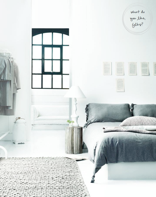
Ah, I do love it when a brand gets their neutrals on point - French Connection's latest homeware collection is a case in point. Offering an array of cool grey textiles, milky white ceramics and textured wooden pieces, the line is just how I like my neutrals to be. Admittedly, I wouldn't furnish a whole space with their pieces (Mr. Bazaar always needs a few brighter hues added to the mix) but I definitely would choose to add elements of this collection to my existing schemes. So, I'd happily snap up the beautiful grey bedlinen (above) but I'd give it a Bright.Bazaar update with a striped yellow throw or a neon pink throw pillow. Something that's a little left of centre would bring the look right in line with my overall interiors aesthetic. You might recognise the beautiful glass vases (above) from my Design market page in the summer issue of Sweet Paul? I felt it was perfectly showed how to cool down with grey hues this summer. What pieces are standing out to you? I'm falling harder for those washed mango table lamps with every passing minute...!
// French Connection
Related Posts with Thumbnails
window.location.href="http://www.brightbazaarblog.com/";