Mr. Bazaar on Instagram!

COPYRIGHT © 2009 - 2012 BRIGHT.BAZAAR

Monday, 31 January 2011

10 Things I Learned & Loved This Weekend

1. Victoria's photographs of San Francisco are brilliant.
2. I love this new print from Sanna Annukka.
3. Columbia Road flower market on a cushion? Don't mind if I do!
4. Graphic, typographical and featuring one of my favourite cities in the world, this These Are Things print is divine.
5. Jonathan Adler's Utopia Lion mugs make me smile.
6. Campaign bedside tables from The Sleep Room are simple and beautiful.
7. Polka dots and stripes in one set of bed sheets. Yes, freakin' please!
8. What's not to love about these midcentury furniture illustrations?
9. Cleaning my flat to Madge's 'Confessions' album results in embarrassing dancing with the hoover.
10. This 'stack it' range that I spotted in Merci, Paris is fun, colourful and functional. Shame it was a touch too big for my carry on...!

Sunday, 30 January 2011

Sunday's Bright Links

1 | 2 | 3 | 4
Handmade weddings and inspired styling.
DIY chemistry beakers and fresh blooms.
Jonathan Adler is heading to the UK. (Time to get saving!)
The hue is blue.
Matchbook mag knocked it's first issue outta' the park!
A heart-melting proposal.
'Dude, will you be my groomsman?' cards are awesome.
Check out Rue Magazine's third issue.

Saturday, 29 January 2011

Happy Weekend

1 | 2
Thank you for your company this week, folks, it's such a treat to dive into your blogs each and every day. I'm planning on a weekend of rest and crafting - my inspiration books have been a little neglected and are in need of some serious attention! Plus, there's a reel of polka dot tape in my desk drawers that I am keen to start using. I'd also like to get some bakers twine to hang inspirational tears in my office. What's on your weekend agenda?

Friday, 28 January 2011

My Latest Rue Magazine Column: Jan/Feb 2011

For the latest issue of Rue Magazine, I turned my attention to the rituals of a New Year and how embracing life's little niggles head-on at the start of the year could pay dividends across the next twelve months. From your home office to the kitchen and beyond, I styled some little vignettes with the hope of inspiring some of the ideas from my article. You can read the whole spread, here. Be sure to look out for the brilliant entertaining story by Annette Joesph, too!
 
Styling and copy by Will Taylor for Rue Magazine

Thursday, 27 January 2011

Parisian Times

Well, friends, I'm back from Paris and despite having a fever for the first two days, I had a magnificent time - thank you for all your generous comments whilst I was away. My last two trips to the french capital have been graced with crisp, clear blue skies. This year, however, was a different story. Grey skies, drizzle and bitingly cold winds dominated the trip. After fighting the fever, and determined not to let anything ruin the visit, I embraced the grey skies by shooting some snaps through a sepia lens. Here are a few photographs that I hold fond memories of: The breathtaking square of Place des Vosges, the soothing symmetry of the tree-lined streets that lead away from the Arc de Triomphe and, of course, the Eiffel Tower glistening delicately in the night sky. As for my shoes, well, I liked the way the camera captured the weathered effect of the suede; it told the story of the trip perfectly - walking, walking, walking! We stayed in The Marais and spent most of our days wondering in and out of independent boutiques, florists and kitchens. I could go back in a heartbeat, but at the same time there is something special about returning to the comforts of home. I've missed you guys - it's good to be back!

Home Tour: Jonathan Lo's Southern California Home

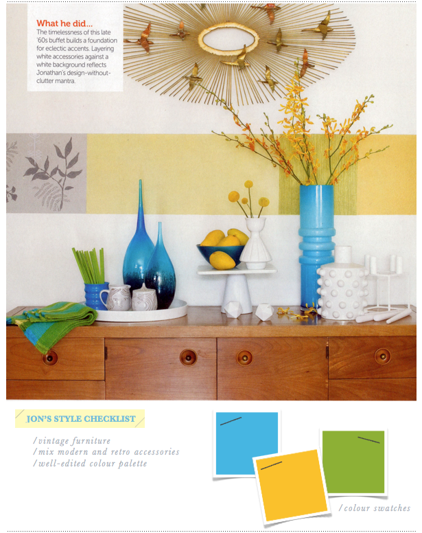
Before we go anywhere, how stinkin' cute is Jon's dog, Pepe?! OK, back to interiors, and namely the interior of Jonathan Lo, the founder and principle and creative director of J3 Productions, a multidisciplinary design studio and consultancy that services the lifestyle, fashion, decor and retail sectors. Phew! A busy chap for sure, but not too busy to curate a welcoming home - one that details a fusion of retro hues and flea market finds. Of course the zingy turquoise and yellow shades caught my eye, but it's the inviting, vibrant and relaxed vibe that Jon has created which really sells the space. Colour blocking throughout the open-plan home serves to zone the space, from a bright orange reading nook to a flavescent stripe signifying the dining area. Anyhow, dive on in and check out the space for yourself - and be sure to keep an eye out for the details, including the sweet papier mache owl and dipped dining chair.
Feature via DIY Ideas Magazine | Photography by Michael Garland

Wednesday, 26 January 2011

Rue Blog: Outfit to Room

1 | 2
You know what, folks? I simply love yellow! This is no surprise given my penchant for bold brights, but this last week or so I've been hooked on this preppy hue; my magpie-like eye drawn to it left, right and centre. So, I headed over to the Rue Magazine blog with some handsome chaps and sweet-like-buttercup interiors in toe, and found myself a little Yellow Therapy. Check it out, here.

Three Ways: Grey in the Bedroom

Maybe it's because it marries with such ease to yellow (one of my favourite colours), or perhaps it's the restful vibe it gently oozes. Either way, grey really chimes a decor-loving cord within me - and it makes for the perfect hue when it comes to decorating bedrooms. The versatile colour can be called upon in various different shades for varying effect. Whilst I love the drama of the second scheme, my heart pulls me towards Gentle Romance - yes, there's the saffron yellow, but the subtle nude tones of the sheets and overall relaxed vibe also have me sold. Which scheme is for you?
1 | 2 | 3

Tuesday, 25 January 2011

Details, Lili Diallo

I've been excited to read Lili Diallo's book, Details, since I heard about the project late last year - now I've had the chance the leaf through the pages of Clarkson Potter's latest offering, I know it doesn't disappoint. You will find yourself lost for hours in amongst the streams of inspirational photography by Annie Schlechter, who so perfectly captures Diallo's work. Split into five sections - Texture, Colour, Objects, Mood, Dash of Style - it's easy to dip in to quickly to find specific ideas, or take time to leisurely read the book. Given Diallo's passion for the details, it was no surprise that I found myself drawn to the close up vignettes she had created: Delicate blooms soften a navy tablescape; Espresso bowls, and vintage tea cups in brightly coloured hues, offset a white crockery set; and Polaroids add personality to a mantle. Diallo's tone is friendly, upbeat and personable throughout, which, for me, is the book's strongest USP. That said, I was never not going to love a book with a section titled, 'Staging a Bright Intervention', was I?!
Details by Lili Diallo (Text written with Zoe Wolff) | Photography by Annie Schlechter | Published by Clarkson Potter

Monday, 24 January 2011

Mr. Bazaar in Paris

1 | 2 | 3
I hope you all had magnificent weekends? I've popped across the pond to visit Paris for a few days, but will be back with more brights from the world of interiors tomorrow. In the meantime, I shall wish you all a great week from afar - probably with a pastry (or two) in hand!

Sunday, 23 January 2011

Sunday's Bright Links

1 | 2 | 3 | 4
This branding and packaging is almost good enough to eat.
This paint-dipped furniture is kinda cool.
Sunday in San Francisco.
Mr. Bazaar heads to Poppytalk.
A great round up of the top 10 hotels in Palm Springs, California.
A lovely interview with the Editor of Real Simple online.
An utterly delectable combination of blue and yellow.
A custom bulletin board by Thomas O'Brien.
This wedding photographed by Max Wanger is utterly breathtaking.

Saturday, 22 January 2011

Happy Weekend

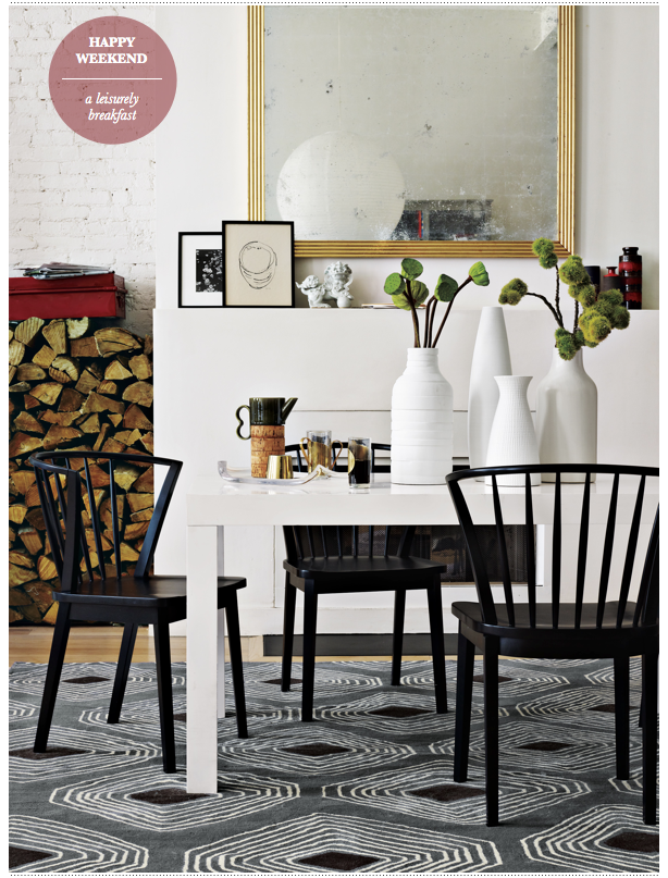
One of the things I've come to love about weekends are leisurely breakfasts. We charge through the week, barely lucky to grab a slice of cold toast before dashing out the door, or setting up camp in our home offices to start a day of work. Yet come the weekend, we can take our time to indulge in the pleasure of a long, drawn out breakfast. And I've found that taking in the weekend supplements, or talking with loved ones, is a ritual I long shall cherish. Have a good one, folks. 

Friday, 21 January 2011

Dulux Spring '11: Forest Falls

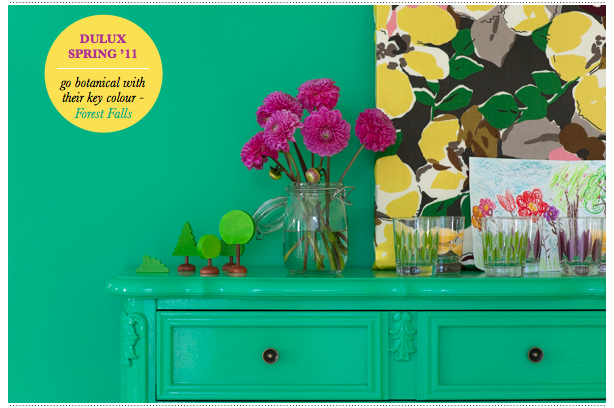
This spring season sees a strong botanical trend in the UK interiors market, with many of the core high street brands choosing to include floral illustrations and colours in their key collections. No surprise, then, that Dulux considers the Forest Falls shade of green to be the key colour from their latest collection of paints. With six shades to choose from, there's certainly room for working the punchy green hues into botanical schemes. I'd opt to use this colour to make a quirky statement - just like they've done with the silhouetted standard lamp. For me, it's those little, quirky features that make a house a home. P.S. Isn't that faux plate shelf kinda fun? It's great to see a paint brand illustrating how the gloopy stuff can go beyond your standard feature wall. Bravo!

Thursday, 20 January 2011

Three Statement Ideas For Your Bathroom

Whether it's squeezed into a tiny cupboard under the stairs or within a double-height room inside a grand mansion flat, many of us will look upon our bathroom as a place of sanctuary. Oddly, I believe we encounter the same decorating concern whether our bathing space is big or small: how do I create a striking statement in a space so regimented in its components? In a small space we feel restricted by the lack of, well, space and in a large bathroom it can be a struggle to make it feel cosy and inviting. Tackle the latter by zoning the space - a half-height wall in zingy tiles will create smaller, nook-like spaces. Whereas, in smaller bathrooms, turn your attention to what's already there - a coloured tub or an update to an everyday item, like a mirror, which can become the statement if used in an unusual manner.
1 | 2 | 3

Wednesday, 19 January 2011

Elle Decoration, February 2011

This month's issue of Elle Decoration is so jam-packed with ideas, you would be forgiven for feeling a little unsure of where to start by the turn of the last page. I found myself tearing page after page - and I've not done that for quite some time. February's features are inspired yet accessible - a good balance for this more high end title. Inside you'll find: 21 easy ways to revamp your kitchen; decorating with classic whites with a citrus twist; a tour of Swedish textiles designer Lotta Jansdotter's New York apartment; the eclectic Brighton home of artist Jayne Neale; a guide to displaying the things you love and, of course, an array of breathtaking homes - my favourites being a dramatic white apartment in Munich and a character-filled New York warehouse space. Dive in and tell me what's stealing your heart!
Related Posts with Thumbnails
window.location.href="http://www.brightbazaarblog.com/";