Mr. Bazaar on Instagram!

COPYRIGHT © 2009 - 2012 BRIGHT.BAZAAR
Showing posts with label Living room. Show all posts

Thursday, 29 November 2012

Three Ways To Add Colour With A Bookcase

Bookcases: whether big or small I'm sure we all have one in our home, right? This trusted storage staple is also an ideal element for bringing colour into a space, so I decided to pull together three ideas that do just that. Up first is 'exotic brights', a refreshing lime green scheme that utilises colour in a bookcase to visually pull two separate spaces together. This vibrant yet calming scheme is achieved by painting the recessed bookcase in the same hue as the stripes on the bathroom floor, resulting in a cohesive and spacious look. (If you're interested, I blogged the whole tour of this home last year.) Second on the Bookcase Billboard is 'lemon surprise' a high energy, palm springs inspired space that sees a colour block yellow bookcase take centre stage. By styling your bookcase with pieces from the same palette as the bookcase itself creates a striking colour-on-colour statement out of the piece, which brings stacks of vitality to the room. Finally, my favourite of the three looks, 'eclectic pastels'. Ideal for renters or crafty types, this look sees scraps of wallpaper or wrapping papered on the backs of random shelves from which complimentary colours are added through accessories making the bookcase look relaxed and effortless - and, crucially, not messy! Which of the three takes your vote, folks?
// 1. Alexandra Angle; photography by Lucas Allen | 2. Livingetc; photography by Chris Everard | 3. Pynt

Wednesday, 7 November 2012

Three Ways To Add Colour To Your Living Room

Today I wanted to look at three different ways to add colour to living rooms because I've seen so many fantastic spaces packed with colour. The first scheme, Candy Colour, is the ultimate fun loving space and is easy to achieve with a statement armchair and vibrant textiles. The red thread that ties all the elements together? The stripe pattern across each element of the space. I love it! The second idea, Pastel Pretty, is the perfect scheme for those who like their colours to play a central role in their schemes, just in a more subdued manner. This look is achieved by layering in sorbet-like hues upon a calm and neutral palette. My top tip is to stick to one key hue, then mix in shades from within the same colour family; complete the space with no more than two accent colours to prevent the look from feeling too 'busy'. The final scheme, Painterly, is a fine example of how to use colour to create a striking statement without loosing femininity. This is because soft brush strokes of colour, as opposed to the harder lines like those in the Candy Stripe scheme, bring a delicate feel to the space that suits the blue and violet colour palette. Which look gets your vote, friends?
// 1. & 2. Country Homes & Interiors; photography by Jeremy Baile and Jon Day | 3. House to Home; photography by Dominic Blackmore

Tuesday, 23 October 2012

How To Decorate With A Complementary Colour Palette

The best approach when combining two hues to make a colour statement is to pick from opposite sides of the colour wheel. This living room is a fine example of this decorating method: the teal blue walls paired with the burnt orange ceiling results in a striking yet balanced scheme. Notice how the main piece of furniture - the tufted couch - is in a slightly lighter shade of the teal walls, this prevents the piece from detracting or competing with the main statement of the room - the walls and ceiling. The strong colours of the scheme have been anchored with neutral textures, such as the jute rug and wooden table. For me, this shows how a well-executed colour scheme can breathe life into an otherwise formal and traditional space. Plus, the tufted couch is the definition of Divine, right?!
// House & Home | Photography by John Cullen

Friday, 14 September 2012

Home Tour: Relaxed Swedish Country Style

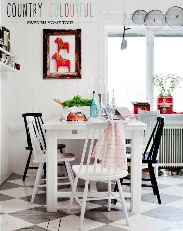
As much as I enjoyed the heat of last weekend in London, I'm also looking forward to the cosy days of Autumn that stretch out ahead. This country home in Sweden feels so perfect for this new season as layers of comfortable textiles are generously applied throughout the space. Plus, the red and white colour palette in the kitchen area (which actually flows more subtly through the rest of the home - see the bedspread and rug in the living room) feels festive and gently evocative of the holiday season. I always admire homeowners who embrace colour and pattern with stylish abandon, and this is one such example where both elements are used in abundance without going overboard. My favourite room is the living room, where the generous helping of natural light has been tempered with layers of linens, interesting artworks and up-cycled palette furniture, in turn keeping the space cosy and inviting. What do you like about this home?
// Photography by Lina Ostling for Hus & Hem

Friday, 11 May 2012

Colour Palette: Weathered Charm

A space really starts to come together when you combine a considered colour palette with textured elements. Here we see how a battered chesterfield sofa brings charm, personality and a sense of tactility, whilst references to the brown and fawn tones are seen in the rusted metal accent pieces, such as the floor lamp and bird cage. These items bring further texture to the space, so they are softened with midnight navy (one of brown's best buds!) throw pillows. The vintage oil can pulls the individual elements together by featuring all of the hues. Anyone for movie night? This living room looks super comfy!
// Real Living

Thursday, 3 May 2012

Pillow Perfect: Hot Dates for Your Sofa!

Pillow Perfect GIF 
I have a little confession to share with you all today. I'm a Pillow Pusher! Yep, for years now I have been playing matchmaker for many a sofa, always on the hunt to find them the hottest and most stylish date in town. So, today I'm widening my net and sharing some of the best pillow picks on the market right now for your sofa. In the little gif above not only can you see just how excited I get about throw cushions (ed: Mr. Bazaar might need to check into home accessories rehab soon) but you can also see each of the pillows in turn as they are added to the sofa - and there's something for everyone. Are you a colour lover? The Hove or Nice cushions are your best friend. Perhaps you go gaga for anything graphic, then the Anchor or '&' designs are for you. If you're looking to add a dash of whimsy, opt for the Gran designs or the needlepoint owl. More of a vintage maven? The soldiers fabric pillow is bound to delight. Or, if you're the crafty type, why not silkscreen print a fabric cover like I did with the Clarissa Hulse design at a recent Dalani event! So, tell me, are you a Pillow Pusher? Which one are you going to set up to date your sofa?!
// Photography by Will Taylor

Wednesday, 18 April 2012

Colour Palette: Eclectic Living Room

Whenever I'm chatting about decorating with colour, be it with a friend, family member or journalist, I'm always asked, 'How do I start adding colour to my space?' The answer is simple: layering. Start with your neutral canvas (in this case a palette of creamy white and cool grey) and then begin adding in hues in layers. First you might scatter a few vibrant throw pillows onto the couch. Like the result? Great, why not add a similar shade from one of them in a larger statement piece such as a rug. Anchor this bold addition of colour with an accent piece - here this is achieved by the red coffee table upon the mustard yellow rug. Live with the space for a while, adding in and switching out pieces with the seasons, your mood or even trends. Artwork is a sure fire way to bring both colour and personality to a space, and personally I love to change out prints every few months to bring a new angle to a room. Have you added colour in any of these ways before?
// Lifestyle image from Real Living | Styled by Mette Helena Rasmussen | Photography by Tia Borgsmidt

Wednesday, 25 January 2012

Take Your Pick: Yellow or Green Bookcase?

IKEA via Livet Hemma
Hurrah! We've reached the middle of the week so a customary Happy Hump Day, folks! I stumbled upon these two bookcases from IKEA and knew in an instant that I liked them both. Clean, sleek and modern in their design and colourful in their execution they felt perfect for a Bright.Bazaar home. The only problem? Deciding which one I like better. The yellow finish provides an uplifting, vibrant and bold statement to the space, plus it pairs effortlessly with the black and white colour scheme. Whereas the green provides a more serene feeling, blending well space around it. I think I'm verging on preferring how the yellow option looks; it just feels a little more playful and graphic, but which would you pick?

Wednesday, 21 December 2011

IKEA'S Festive & Textural Living Room

Livet Hemma | Photography by Patric Johansson
Oh, be still, my beating heart! What a calm, cosy and refreshing living space this is from the folks over at IKEA. I'm inspired by their use of rugs as additional textiles for the sofa - such a great way to add extra layers of texture. The simple red runner used on the sofa lifts the pared-back scheme, as well as adding a dash of festivity. The reclaimed shipping palettes give the room an organic feel, echoed in the bud branch placed in a simple, glass jar - an ideal way to add gentle festivity to a space. What's inspiring you about this living room, folks?

Thursday, 10 November 2011

Colour Palette: Romantic Living Room

Something about this traditional living room space caught my attention. Yes, the burnt orange hues and deep pinks are a striking element of the scheme, but it was more than that. The billowing, almost elongated drapes are a nod to the dramatic height of the room, whilst the oversized, circular ottoman hints that the space is for relaxing in, despite the otherwise formal furniture. Finally, the well-balanced colour palette is demonstrated through the addition of olive green and blue shades that break up the louder orange and pink hues. What elements of this scheme do you like best, friends?

Thursday, 7 April 2011

Cosy Living Room Nook - Ways With Darks

Something about this space makes me think of places I've stayed in Paris. Perhaps it's the similarity to the French capital's dark-hued fashion (we all know Parisian's like to wear black!) or maybe it's the cosy nature of the space. I love how the silky grey walls let the hot orange hues take the spotlight, with the olive green chair and pendant shade holding the scheme together. It looks like it would make for a delightful breakfast area, don't you think?

Wednesday, 30 March 2011

Mid Century Modern Living Room

Lately my love for mid century modern furniture has stepped up a notch and I've been trying to find out what triggered my higher than normal levels of Mid Cent Lust. Eventually I came back to this delightful living space. Since I pinned it to my Pinterest account a few weeks ago I've had it on the mind: the mustard yellow sofa, art wall, mid century pieces and lashings of natural light have me weak at the knees every time. What do you like about this space?

Thursday, 10 March 2011

Stripes & Brights In Downtown Buenos Aires

I think this might just be my ideal lounge. The mix of stripes, brights and vintage furniture underneath that dramatically high ceiling and rustic exposed bricks has my heart racing! It looks like one of those rooms that would be gloriously bright and airy in the summer months, then cosy and welcoming when it became colder outside. In fact, the whole house is pretty wonderful - see more of it here. What do you like about this space?

Tuesday, 15 February 2011

Three Bold and Beautiful Living Rooms

These three living rooms are fine examples of how to use bold hues in the living room. Each scheme may look different, but at heart they have embraced the same philosophy: Be brave and bold with colour. From the cosy country look of Terrific Teal to the masculine feel given by the Slate Grey scheme, each space tells a tale of the owner's aesthetic and personality. And it's all thanks to their confident use of colour. I'm a fan of all three, but something about those teal hues calls out to me. Which space is for you?
Red | 1. Loupe Images; Photography, Polly Wreford | 2. IPC Syndication; Livingetc; Photography, Paul Massey | 3. Gap Interiors/Mel Yates; Designer, Abigail Ahern

Tuesday, 11 January 2011

Michael Penney Style: The Portfolio

Oh boy, has Mr. B found some inspirational spaces inside Michael Penney's portfolio. Penney calls himself 'your friendly neighbourhood decorator', and the spaces he creates are testament to just that: the aspirational yet accessible styling amongst his gently colourful designs make for striking bedrooms, delicate dining rooms and classic bathrooms. I mean, who wouldn't want to pull up that Duck-egg blue chair and leaf through The New York Times?! Michael is a decorator, stylist and magazine editor whose philosophy on creating a home rings true with my own: "Creating a beautiful home is all about self-expression and feathering the nest with things that make you just plain happy." Spot on, I think. As for a favourite of his designs, I simply couldn't choose, but my top three are: the kitchen nook (above), the classic bathroom and the rustic dining room. Which rooms do you like?

Wednesday, 19 May 2010

{I'm moving in...}

...to here.
Why?
Triple-height windows, patchwork sofa and starburst mirror = my dream living room.
But, seeing as I'm not really moving in, let's see how to get the look...

1. Clairemont Coffee Table, Crate and Barrel; 2. Starburst Mirror, Furniture Butler; 3. Jelly Beans Rug, John Lewis; 4. Sofa, Squint; 5. Armite Floor Lamp, Pedlars; 6. LSA Clear Vase, Heals

Wednesday, 28 April 2010

{The Rise of Mid-Century Style}

I was interested to read this morning that the high-street is to move away from more classical styles to embrace Mid-Century flavoured collections. You can read the full article from the Guardian here. In the meantime, swoon over Danish designer Finn Juhl's calming living room. I'm loving the exposed wooden floors and that white sofa is too stylish for words.

 Image: Sekaibunka Publishing Inc
Related Posts with Thumbnails
window.location.href="http://www.brightbazaarblog.com/";