Mr. Bazaar on Instagram!

COPYRIGHT © 2009 - 2012 BRIGHT.BAZAAR

Wednesday 31 August 2011

Harlequin's Kallianthi Collection

Harlequin
It's great to see this refreshing approach to product styling by Harlequin, whose new collection 'Kallianthi', designed by Clarissa Hulse, contains a wealth of pattern and colour across fabrics and wallcoverings. The name 'Kallianthi' means 'wild flowers' in Ancient Greek and reflects the enchanting botanical-inspired designs. Inspired by long walks in the countryside and her half-Greek heritage, Clarissa's range rejoices in glorious fusions of bright and bold, offset by pared back neutrals: magenta, paprika, coral, stone, citrine, indigo and many more beautiful colours feature across the range. The collection launches at Decorex 2011.

Tuesday 30 August 2011

Three New Rugs On My Wishlist

1 | 2 | 3
They say good things come in threes and it's certainly true with these rugs I spotted over on Urban Outfitters this morning. Hard to pick a fave (hey, all that colour and pattern makes Mr. Bazaar very happy!) but I'm going to go for Mandela (at the top). Which is your favourite?

Monday 29 August 2011

Crate & Barrel's New Table Lamps

1 | 2 | 3 | 4
It's a bank holiday here in the UK today so I thought I would just pop in quickly to share these table lamps before heading out for a country walk later on. Ever since I discovered the Stephen's table lamp last weekend I've been meaning to check out Crate&Barrel's full lighting offering. It turns out that the brand has an extensive and diverse range of styles on offer. Whilst the Stephen lamp still wins out overall, I do like the Kelly table lamp (1). Do you have a favourite?

Friday 26 August 2011

Friday Giveaway: Kitchen Colourful!

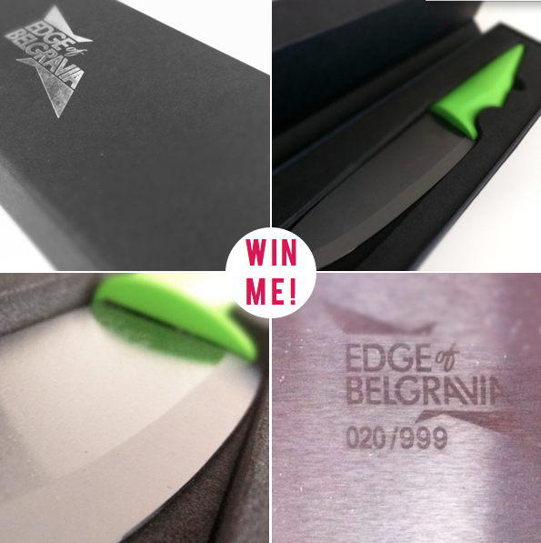
A few weeks ago one of Bright.Bazaar's sponsors, Edge of Belgravia, kindly sent me one of their limited edition knives to try out. Given I've always loved cooking, I was really excited to whip something together with a new, super sharp knife, which also boasts a vibrant, lime green handle (this, of course, made Mr. Bazaar very happy!). The best part? The ceramic blade stays sharp without needing to be sharpened. Result! Edge of Belgravia are generously giving one Bright.Bazaar reader the chance to win one Ceramic Lime Chef's Knife (worth £70). To enter, just leave a comment below before midday on Monday 29 August when I'll randomly pick a winner. Open to readers worldwide. Good luck, folks!

Thursday 25 August 2011

Blue & Yellow Summer Tablescape

David Stark | Rue | Photography by William Brinson | Prop Styling by Raina Kattelson | Food styling by Rebecca Jurkevich
This tabletop would have been the perfect setting for an evening dinner on my recent sunshine break to Menorca; the Mediterranean blue hues and saturated yellow shades took me right back to the colours that inspired me on the trip. My favourite elements of the table are the handmade flowers (David Stark is a genius, right?!) and the paintbrush place cards are an unexpected, playful touch. I also love how the olive tree adds height and drama to the table. Anyone else in the mood for an aperitif and a little party time?

Wednesday 24 August 2011

Typographical Breakfast Nook

1 via 2
There's so much I love about this little breakfast space: the swing leaf table; the box benches with cushion pads; the gloss black pendant; the blue and white crockery; and the lashings of natural light. However, the real winner here is the alcove that has been wallpapered with a typographical paper - doesn't it look great?!

Tuesday 23 August 2011

Tablescape: Lavender Summer Soriee

KTMerry
Do you have a last minute summer soiree on the horizon (or maybe your first of the warmer seasons if you're Down Under)? I fell for this rustic yet delicate tablescape the moment I saw it, the soft linens, textured, weathered table and fragrant lavender seems such a winning combination. The table is set with little details in mind, from springs of lavender on the place cards to little flags placed amongst the posies of blooms that run along the centre of the table. The attention to detail continues around the table, too, with a charming drinks and favour bar, which gives guests a scented lavender bag to take away. Let's be honest though, folks, it would be hard to not want to take it all home!

Monday 22 August 2011

10 Things I Learned & Loved This Weekend

1. Regatta bedding with yellow accents? Unison knows how to make a boy smile.
2. Bought this washbag duo from H&M - a steal at £8!
3. Spent Sunday morning taking in the British Museum and it's beautiful glass ceiling.
4. The coloured foils on these chocolate bars in Liberty caught my eye.
5. Seeing these Fallow Deer made my weekend.
6. Can't wait to wear my first crew jumper of the new season.
7. Crate&Barrel out did themselves with this striking table lamp.
8. Love, love, love this mug.
9. This pair of green brogues are lovely.
10. I think I'm addicted to rustic, textured linens.

Sunday 21 August 2011

Sunday's Bright Links No.49: Fisherman's Cottage

1 | 2 | 3 | 4 | 5
Bright.Bazaar
The sun-soaked, saturated hues inspired me in this post about my highlights from a trip to Menorca, Spain.
RICE's colourful and quirky autumn/winter 2011 collection.
Loved these six tablescape inspirations from BHLDN decor.
It's always inspiring to see how one room can so different with a new palette of paints - here's one room, four ways.
Cabbages and Roses' latest collection is a feast of country-style pattern and soft colours.
Colour Palette: Turquoise, Yellow and Orange.
Embracing Blue.

Elsewhere
I can't wait to have an excuse to make this number pinata!
Enjoyed these beauitful photographs of La Rochelle, France.
Tempted to make these mini milkshake shooters that I found over on Rachie's blog.
I pulled together my best lighting picks from the current trend for the filament bulb.

Saturday 20 August 2011

Happy Weekend: Embracing Blue!

1 | 2 | 3 | 4 | 5
As the last few weeks of summer roll by here in London I'm keen to soak up every last drop of the bountiful blues associated with the season. Whether in the bedroom, kitchen or on the table, I just can't get enough of this hue. So this weekend I intend on getting as much blue into life as possible: from a turquoise cocktail on Saturday night to a walk under a clear, ever-lasting blue sky, my weekend involves many a date with blue! What's on your weekend agenda, friends?

Friday 19 August 2011

Colour Palette: Turquoise, Yellow & Orange

BHG
Summer feels like it's slipping away fast here today (it's due to hot a bit over the weekend, though - fingers crossed!) so I wanted to share this delightful sunroom from Better Homes & Gardens. This is a great example of how to work with three strong hues in the same space: turquoise, yellow and orange are all powerful colours but used carefully they can work together. Here we see how orange is primarily used in rugs, which serves to ground the scheme, whilst the light turquoise colour block ceiling lifts the space, drawing the eye upwards and adding visual interest. Meanwhile, the graphic yellow stripes, buttercup-coloured blooms and patterned textiles all serve to break up the blocks of the two hues. The perfect retreat after a long afternoon of tennis!

Cabbage & Roses' Latest Collection

Cabbages & Roses
Pour yourself a cuppa, folks, because this latest collection from British brand Cabbages & Roses couldn't be more, well, British. Founded in the year 2000, the brand encompasses British heritage and takes that to the heart of it's products, all of which hold a sense of British eccentricity. Country-style patterns adorn many of their fabric designs, which are available to buy by the metre or in ready made cushions, tablecloths and more. Whilst an overly country-inspired scheme wouldn't be my choice for an everyday space, the idea of having a weekend country escape decorated in such a way most certainly does. Anyone for high tea?!

Thursday 18 August 2011

One Room - Four Different Colour Schemes

Real Simple | Photography by Gentl & Hyers | Paint Palettes by Eve Ashcraft | Styling by Jeffrey W.Miller
For the August edition of Real Simple, Eve Ashcraft, author of forthcoming book The Right Colour, pulled together four different colour schemes for the same room. The beautifully styled story illustrates how you can work a palette of multiple hues into one room to great effect. I've named the schemes: Colours of the Sky, after the first room's gentle blue and grey hues; Sun-soaked Yellow, for the second room that shows how one step up from a standard beige can make an invigorating difference; The Colours of Nature, a name inspired by the moss green walls and rich green trim of scheme three; and, lastly, Powerful Passion, where a variety of deep, dark red tones are combined with dramatic results. The Colours of Nature takes my vote - there's a secret garden feel about the palette that makes the room feel romantic and calming. Which scheme has you reaching for the paint brushes?
Related Posts with Thumbnails
window.location.href="http://www.brightbazaarblog.com/";