Mr. Bazaar on Instagram!

COPYRIGHT © 2009 - 2012 BRIGHT.BAZAAR

Monday 30 April 2012

10 Things I Learned & Loved This Weekend

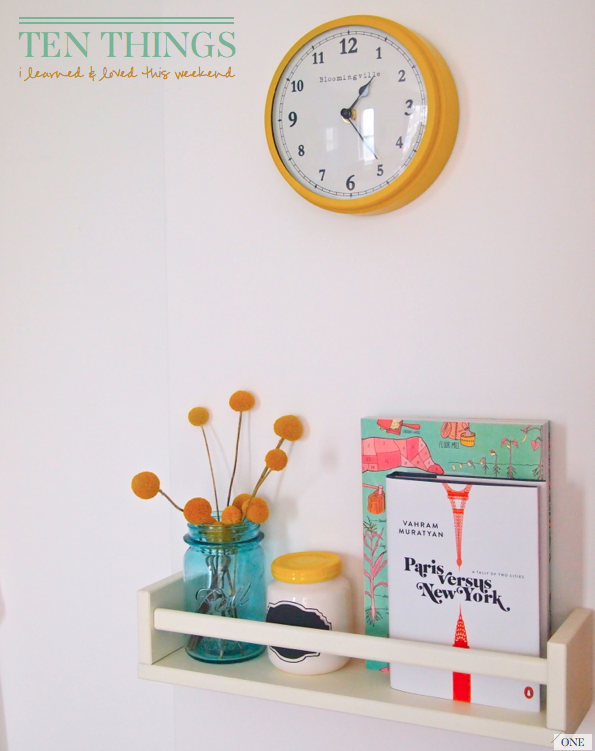
1. Rearranging one of my kitchen shelves and hanging a little yellow clock above it.
2. Loved this 'hello' mug.
3. A cosy Saturday morning brunch in Le Pain Quotidien.
4. These colourful matchboxes caught my eye.
5. Helping my mum hang her new dining pendants.
6. Discovering that you can use these colourful legs to customise your furniture.
7. Fell in love with this journal.
8. A bargain patchwork bow tie.
9. My balcony needs to meet this pot.
10. One of the best London mugs I've seen.

Sunday 29 April 2012

Sunday's Bright Links No. 79

Elsewhere
Avocado toast recipe.
Hilda takes great photographs.
Beautiful pictures of London fog.
A wonderful trip to a vineyard.
Erin posted this fun glitter star favour wraps DIY.
On the topic of DIY's, check out this candy stripe favour box.
I would love to try this roast chicken dish.
So excited to see my blogging friend Anne-Marie over on Martha Stewart Weddings!

Bright.Bazaar
How to keep a seaside decorating scheme fresh and interesting.
A creative collaboration in east London.
// 1. Mimou | 2. Michelle Edgemont

Saturday 28 April 2012

Happy Weekend: A Creative Collaboration

If you're like me then your idea of an enjoyable weekend includes time reading, surfing the web or getting out into our local neighbourhood to get inspired. One of the wonderful things about living in London is the abundance of creative people and projects constantly popping up across the city. The most recent is a collaboration between Tamasyn Gambell and Eva, who have combined their print design skills and eye for sourcing mid-century Scandinavian furniture into a new store in east London. The store stocks the mid-century pieces which have been re-upholstered in Tamasyn's graphic and colourful prints. As well as furniture the store will also be stocking lampshades and soft furnishings that compliment the main pieces. I love the lampshades (all of which are designed and hand-screen printed in London) especially the below, charcoal and soft peach colourway. Anything catching your eye? What creative projects have inspired you recently?
// Photography by Steven Aron Williams

Friday 27 April 2012

Studio Tour: Sofa.com's Manhattan Loft

I love it when I get a peek into creative spaces and see the environment that a team of people work in everyday. This space belongs to Sofa.com and is their brand new NYC-based showroom. I've been to hang out in their London showroom a few times (which has stunning views of the London skyline), but from the looks of things the view from the loft windows in their Manhattan location is a strong rival! It's great when brands let their staff work in amongst the product on the shop floor, as I think it keeps them in touch with what their customers are responding well to. I'm calling that wall of pillows the Pillow Bar; it kinda feels like a candy store for throw cushions, right?! Either way - love it. If you're based in NYC or near, you're in luck as these folks will ship for free within the city and up to 100 miles beyond for a small fee. Next time I'm in the city I'm definitely checking this showroom out in person!

Thursday 26 April 2012

Colour Cocktail: The Candy Crush

OK, friends, it's time to empty your piggy banks, fumble down the side of the sofa and scrape together your pennies for a trip to the sweetie shop. On the menu? The Candy Crush, a colour cocktail that you can order to suit your personal taste. In the mood for a sugary sweet delight? Keep your pinks bright and bold; your yellows sunny and vibrant, with a high gloss finish. If, however, you'd enjoy a more formal cocktail, you can tone down both hues for a more regal finish: opt for a lavender, dusty pink and pair it with golden shades of yellow. So, with pennies handed over, all that's left to do is share which cocktail you ordered!
// 1. Style at Home; Designed by Nancy Riesco; Photography by Janis Nicolay | 2. Windsor Smith Home

Wednesday 25 April 2012

Colour Palette: Seaside Chic

It may be the spring/summer season's perennial favourite but that doesn't put any black marks against the seaside theme for Mr. Bazaar. No siree! By mixing in your modern pieces with vintage finds you can add texture and depth to the scheme. Take this armchair, for example. Yes, it has a classic blue and white stripe fabric but then reclaimed chair legs give the piece so much more interest than standard legs. Meanwhile, a collection of found glassware mixed in with new buys creates a stylish vignette upon the light mint sideboard. I don't know about you, but Mr. Bazaar could happily have a little beach hut that looked this inviting! Do you incorporate any coastal style into your home?
// Dunelm Mill

Tuesday 24 April 2012

Home Tour: Beth Arrowood's Miami Brights

Beth Arrowood is the founder of Miami-based NIBA rugs and her home is tropical treat of colourful decorating. Shall we take a look around? Come on in - the waters lovely! With walls painted in Caribbean Blue Water by Benjamin Moore you can't help but feel like you have been whisked away on an exotic holiday when you see inside Beth's home. Given her rug business it's no surprise that Beth advises one to start with the rug and work up from there when decorating a space, but her space is testament to it being sound advice. I love how each room has it's own unique feel yet the house as a whole flows with visual ease. This is helped by the core palette of turquoise hues that run throughout, both inside and out. Beth has added occasional yellow or green accents that break up the bold blue base tones. Great job! Anyone for a trip to Miami?!
// Photography by Mark Roskams

Monday 23 April 2012

10 Things I Learned & Loved This Weekend

1. The quickest way to colour happiness? It's as easy as one, two, three!
2. Love the feeling underfoot when standing on my Zara Home rug.
3. This is my kinda stationery!
4. My two little pots from Amsterdam look great against this blue wall.
5. Saturday night involved a full on pamper session with Conran's Bath and Body product range. I love the fresh, citrus scent of number two!
6. Headed out on Sunday in some of my favourite pastel pieces.
7. How beautiful is this print by Janis Nicolay? My walls are lusting after it big time!
8. Blue and white simplicity never fails to catch my eye.
9. How fun are these swimming shorts? Perfect for summer holidays!
10. It would be fun to spell out 'Bright.Bazaar' with these stencil letters.

Sunday 22 April 2012

Sunday's Bright Links No. 78: Summer Dreams

Elsewhere
Styled mag's sixth issue went live.
I would like to shop here, please.
Michael Graydon is a super talented photographer.
Bonnie's lovely breakfast post with Erin.
Fun and colourful DIY with a terracotta pot.

Bright.Bazaar
Take a peek at what I learned and loved last weekend.
Three ways to a colourful breakfast nook.
I headed over to Laura Ashley to talk about finding colour ideas.
// 1. Peggy Wong | 2. via sfgirlbybay

Saturday 21 April 2012

Happy Weekend: Pastels & Neon Mix

Weekends are often about taking time out to refresh and recharge, right? That's why I wanted to share this peek at Caroline Gomez's living space; it feels right on the button when it comes to a light, airy and relaxing space. The cool, crisp paper white base palette is ideal for having a little fun with colour as Caroline has done by combining neon and pastel hues. The neon accents in the buttons and pillow piping are just enough to off set the softer tones brought to the space by the white base and pistachio colour block wall. Talk about colour me happy! If you like the look, you can shop similar items in Caroline's online shop. Do you have a fun weekend planned? Will you be relaxing at home or out and about having fun? Either way, enjoy!
// image via Bloesem

Friday 20 April 2012

Finding Colour Inspiration & Ideas

I get a lot of my colour inspiration from travel, as well as just walking around in the natural environment. I love to try and notice colourful little details that could otherwise pass me by in life. So, I headed over the the Laura Ashley blog to share some of my recent colour inspirations, both from travels and closer to home, as well as share some ideas for how you can find colour inspiration. In the post you will see some of my photographs from Italy, to Paris, to London and beyond! When I was in Paris I visited Merci and I spotted this paint splattered tabletop, which I fell in love with it at first sight. I'm thinking it's probably been a base for some serious creative happenings...! Isn't it great how the smallest little details can inspire us? You can click here to read the whole post for more of my snaps.
// Photography by Will Taylor

Thursday 19 April 2012

Three Ways: Colourful breakfast nooks

I love breakfast nooks. Fact. There is something cosy and welcoming about them that I always relate to. For me, breakfast is a time to gather one's thoughts for the day ahead and enjoy a moment of calm before the day kicks off. In my little London flat I sit at my dining table to eat each morning but one day I'd love to have the space to create a dedicated area as seen in these three spaces. The first, Circus Brights, is ideal for colour-loving families as it sees cheerful hues paired with weathered wooden surfaces resulting in a stylish, grown up take on a multi-coloured scheme. I love the Scandi feel to this nook, achieved with the tongue and groove panelling and white washed floors and walls. The second space, Citrus Zing, shows how modernistas can add fresh, bold accent hues to even the most stark of spaces. And finally, Lazy Lemon (by far my favourite name of all three!) is perfect when you have a feature you don't want to overshadow. Here, the breathtaking view from the picture windows is framed by a sophisticated palette of cool grey and muted lemon - a real winner in my book! Which of the three do you like best?
// 1. LaLole | 2. Real Living; Styling by Erin Michael; Photography by Tony Amos | 3. Ken Linsteadt Architects

Wednesday 18 April 2012

Colour Palette: Eclectic Living Room

Whenever I'm chatting about decorating with colour, be it with a friend, family member or journalist, I'm always asked, 'How do I start adding colour to my space?' The answer is simple: layering. Start with your neutral canvas (in this case a palette of creamy white and cool grey) and then begin adding in hues in layers. First you might scatter a few vibrant throw pillows onto the couch. Like the result? Great, why not add a similar shade from one of them in a larger statement piece such as a rug. Anchor this bold addition of colour with an accent piece - here this is achieved by the red coffee table upon the mustard yellow rug. Live with the space for a while, adding in and switching out pieces with the seasons, your mood or even trends. Artwork is a sure fire way to bring both colour and personality to a space, and personally I love to change out prints every few months to bring a new angle to a room. Have you added colour in any of these ways before?
// Lifestyle image from Real Living | Styled by Mette Helena Rasmussen | Photography by Tia Borgsmidt

Tuesday 17 April 2012

How to mix, match & clash colour!

Shop the market picks: 1. Yellow lasagne dish, $52 | 2. Purple and green salad plate, $16.99 | 3. Ikat bowl, $0.99  | 4. Ooti fabric | 5. Yellow fruit jug, £30 | 6. Ditte sofa, £2698

As soon as I saw this colour clash story in Red magazine, I knew instantly that I had to share it here on Bright.Bazaar because it's a fine example of how to decorate with mix and match colours and patterns. Ironically, even though clashing prints and hues in this manner is essentially about breaking the rules, there are still guidelines you can follow to help keep the scheme looking stylish. Be sure to keep the bulk of your products (whether that's your tableware or your soft furnishings) all within the same palette. Different shades and hues, yes, but all the same colour family. Then, to add your clash twist to the scheme, throw in a decorating curveball with a contrast colour. This can be seen above with where purple is combined with a contrasting orange or green. The look has a tropical, summertime feel to it, so I rounded up some great buys to emulate the look. Which piece would you buy?
// Lifestyle tear sheets via Red magazine, May 2012 | Styling by Mary Norden | Photography by Laura Edwards

Monday 16 April 2012

10 Things I Learned & Loved This Weekend

1. The yellow cafe chairs in April's shot on my Little Brown Pen calendar.
2. Enjoyed drinking a venti and taking in the view from the passenger seat during Saturday's road trip. It was fun to wear these bright trousers, too!
3. The Focaccia bread with cherry tomatoes, mozzarella, herbs and cracked black pepper I made before it went into the oven. (Yikes! I am 100% addicted to carbs.)
4. I Liked this serene scene by the water in London. Those colourful kayaks are super fun!
5. Arriving home to find a hand written note from the store manager of London's new Jack Spade store proves how American brands get customer service so right.
6. I decided my windowsill needs to get acquainted with at least three of these potting beauties.
7. Richard Haines is one top notch illustrator.
8. These pastel sorbet cups are stealing my colour-loving heart!
9. Bright stripe linens? Yes, please!
10. Love this mint green satchel.
Related Posts with Thumbnails
window.location.href="http://www.brightbazaarblog.com/";