Mr. Bazaar on Instagram!

COPYRIGHT © 2009 - 2012 BRIGHT.BAZAAR

Sunday, 30 September 2012

Sunday's Bright Links No.93: Imogen Heath

Elsewhere
My review of Decorex International 2012 for the Decorex blog.
Mint inspiration in this handmade ice cream cones post.
Have to try and make these DIY copper foil cards.
After reading this post I felt inspired to bring more topiaries into my home.
An amazing magazine cover.
I always enjoy reading (and seeing!) someone's perspective of The High Line, NYC.

Bright.Bazaar - A London Design Festival Special!
Mr. Bazaar explores TENT London.
My top three stands from Decorex International.

Saturday, 29 September 2012

Sneak Peek: Adore Home Magazine, Oct/Nov

I can't quite believe that Adore Home magazine is celebrating it's 2nd birthday already, it seems like just yesterday that I was reading the first issue. Well, two years have passed and the team at Adore Home are set to release their 2nd birthday issue on Monday next week - and lucky us, as we get to take a sneak peek in the super colourful issue right here today on Bright.Bazaar. Kicking off proceedings is a tour of Armchair Collective in New South Wales, a destination store that sells fresh blooms, homewares and food. Should I ever find myself in Australia I'd love to explore here on a Saturday morning. Up next is another shop tour, this time of Kristy Mclaughlin's Sydney store, Kristy Lee Interiors - I'm majorly crushing on the Cockatoo lamp base! I'm really looking forward to reading the piece on the Mr & Mrs G River bar that was designed by one of my favourite designers, Anna Spiro. Anna's use of colour and pattern is always right on point, and this Brisbane location is no exception. Rounding out the sneak peek is a colourful kid's bedroom designed by Maria Barros. I don't care if it was designed for a child's bedroom, I would adopt that blue/yellow work area in a heartbeat! Thank you, Adore Home, for this lovely weekend treat, I can't wait to read the full issue on Monday. What's inspiring you from this peek, folks? Happy weekend!
// Photography from Adore Home magazine

Friday, 28 September 2012

My Top Three Finds At Decorex International

I thought I would round out my week of London Design Festival specials with my three favourite finds from Decorex International 2012. Kicking things off we have Pinch Design, who celebrate simplicity of form and a purity of shape and material. The company's aim is simple: to make pieces that will endure the test of time and aspire to be inherited. I think their pieces are both elegant and arresting; my stand out pieces were the Yves desk for its opulent aubergine hue and the Pendel two seat sofa, which is now firmly on my Wish List.
The moment I arrived on Penny Morrison Fabrics' stand, there was a hoard of people cooing over a pile of cushions. Once I managed to break through the crowd, I discovered that the cushions were these vintage beauties! I also admired the fabric collaboration between Penny Morrison and Carolina Irving - look out for some stunning, tribal-inspired prints.
Little Greene are known for producing a creative stand and this year was no exception. Their dipped paint brushes felt more like an art installation than a trade show stand! I enjoyed photographing the brushes from different angles and seeing how the light fell on the hues. Don't you think it looks great? If you like these peeks, you can see a lorry load more design inspiration in my full review that goes live this Friday on the Decorex blog.
// Photography by Will Taylor

Thursday, 27 September 2012

LDF Report: 100 Per Cent Design & DesignJunction

Although 100% Design and designjunction are very different shows, I felt a synergy between my favourite spots from the two London Design Festival events, so I'm blogging them together in one post. One of my favourite finds across the two shows was Mark, a furniture company who make the down right brilliant (and bright!) Verso chair. Available in five different colourways and two different wood veneers, the Verso is a fine example of where practicality has been balanced with style as the chairs can be stacked up to nine high. Their Arris sofa was also a highlight of mine, potentially for my love of Oak but probably because of the luxurious depth of the design.
Klickity are a playful company whose products almost entirely come in pieces for the owner to put together. My top pick was Fanfare, a colour block clock that it comes in several colourways; I think grouping three together in a row would be a fun office feature. They also make these intriguing XO candlestick holders. Frank Flavell's Leaning Man side table would make a great bedside table, don't you think? 
I've followed James Harrison's work ever since I was given the Rocker chair he designed for Habitat as a 21st Birthday present. I enjoyed seeing the Alwyn Compact Sofa on his stand at 100% Design, especially as you can customise the button detailing to your own taste. In fact, it reminded me a little of this sofa from Kate Spade's London pop up shop.
It's so rocking to see Lorna Syson's business go from strength-to-strength and I think new additions like the Bradbury Lounge Chair will only further her success. Be sure to check her collection out if you are a fan of colourful, graphic prints on cushions, wallpaper and furniture.
Geometrics can be thought of as 'masculine' but Kirath Ghundoo is putting the Pretty into the Geometric! Her new range of Mix and Match wallpapers comes with a choice of seven patterns; the user applies a drop, paste, cut, and re apply technique, which limits wastage and utilises as much of the roll as possible - a fine example of sustainable design.
Lucy Turner specialises in customising and transforming mid century furniture by using a laser cut laminate. I really like her new piece called the Triangle Table, and they look even better as a trio.
Therlermont Hupton is a partnership of Yve Thelermont and David Hupton who work together on their furniture and product design. I admired their playful use of colour across the Lap Mug, Roll Hook and the Dollie & Jessie Stools but their Farm Stool is the piece that caught my imagination the most - super fun!
Clever and functional design is always a winner in my book, which is why I wanted to include Niche London's Lift side table in my round up. The table has a push down handle so that you can make full use of the table top when the handle is not needed.
I think it's fairly evident why I've included Anything's stationery collection. Colour candy and then some - Mr. Bazaar loves it!
Kukka and Very Good and Proper were two other standout finds for me from designjunction. Kukka for their DIY table lamp with fab bright blue cord and Blocks, their desk organisation kit. I'd like to pair one of their lamps with one of VG&P's Canteen chairs.
I'm going to round out this latest LDF round up with one of my favourites, namely the Loop mirror designed by Paul Blease. I like the colourful leather straps which is used to hang the mirror from a simple wooden hook. Simple and colourful design at it's best - fab! So I've shared my favourites but which designs do you like best, friends?
// Photography by Will Taylor & Exhibitors

Wednesday, 26 September 2012

Mr. Bazaar Explores TENT At London Design Festival

For anyone who loves design and interior accessories, TENT London is akin to an Aladdin's cave of stylish and inspiring designs. This year's expanded show proved to be no different, so let's dive in with my favourite finds, shall we? First up is ercol who were showing a recreation of their 203 Windsor armchair. Originally designed in the 1950s by ercol’s founder, Lucian Ercolani, it's a new addition to the their ercol Originals range, which features the company's favourite pieces from their back-catalogue. The upholstery fabric used was designed and hand-printed by Tamasyn Gambell and you can see more of her work further down this post.
The AB Desk was designed by Michael Armstrong as a nod to the traditional school desk but with an added bit's and bob's trough and tray, both made from hand cast concrete - I love how an iPad perfectly fits the tray... a school desk for the 21st century!
Katie Mawson's 100% Lambswool knitted felted cushions are strikingly simple in their design and beautifully soft to touch. I think I'd like to pair the yellow and grey designs together on my sofa at home.
Zoe Murphy's stand launched her new furniture and textiles range, Brilliant Print. I love how Zoe combines recycled furniture and bright colours to create updated, intriguing and unique designs. I chatted for Zoe about the process she went through in creating her new collection and she explained how she has placed a real emphasis on sustainable, ethical design. As a result the collection uses recycled timbers, fairtrade and organic cottons, and 'low impact' inks and paints. Bravo, Zoe!
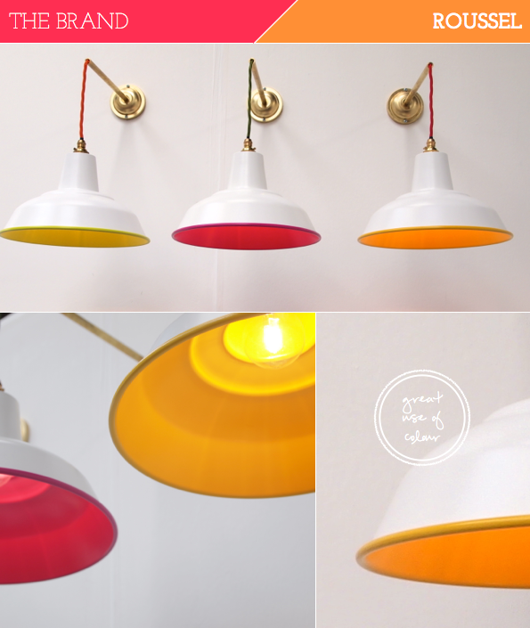
Roussel was founded in 2010 by brothers Anthony and Benjamin Roussel and all their designs are British made. Whilst the brand's debut collection includes seating and tables, it was their lighting offering that caught my eye, especially the surprise colour interiors of the Marie-Lousie pendant.
Petra Green founded Room39 to try and bring more ‘democratic’ design to the market that would appeal to men and women alike, regardless of age. I'm a big fan of her colourful, graphic pieces like the  Marmo/Granit cushion shown here.
Regular readers will know how much I admire the work of Mini Moderns. In fact, Keith, one half of the creative duo behind the brand, said to me during the show that I had almost grown up alongside the brand, which is sort of true! They've just launched their environmentally responsible paint range (Mr. Bazaar would like a room in every colour, please) as well as a range of 100% handwoven Indian Dhurries in their Backgammon and Zag designs.
Having featured Tamasyn Gambell's work on Bright.Bazaar before, it was a pleasure to meet the designer in person. The Bauhaus-meets-Modernist fabric designs looked stunning on the group of lampshades that hung on her stand.
It's always good to find a product that makes you smile when at a show and in this case it was the Coat Eggs hooks. Designed by Daniel Schofield, the product is meant to be used to hang coats without leaving a dent in the material - clever, right? Also, I love the packaging!
The Owls of the British Isles wallpaper by Abigail Edwards was a big hit when I blogged about it last year. Well, I'm predicting that her new Brambleweb design is going to be equally as popular; there is a sense of timeless beauty to the design that I like.
To round out my review of TENT London I thought I would share my snaps from Sian Elin's (she's just up there next to Mr. B!) debut homeware collection because it was like being at a colour candy store! Sian and I discussed her inspirations for the first collection and she explained that it reflects the Islamic and Moorish architecture she saw on her travels through Israel, India and the Mediterranean. For me the marriage of colour and pattern in her Tress pillow is spot on! Tell me, friends, which of the designs I've shown appeal to you?
// Photography by Will Taylor, exhibitors & Boscolo

Tuesday, 25 September 2012

100 Per Cent Norway, LDF: Mr. Bazaar's Five Favourites

One of my highlights from last week's London Design Festival was being shown around 100% Norway by one of the show's Curators, Henrietta Thompson. Although simple in form, many of the pieces on show were both bold and imaginative at the same time. Having the opportunity to speak with a mix of experienced and up and coming designers was a real treat. Here's my top five favourites designs and what I learned about each from their respective designers:

1. Hallgeir Homstvedt's Tangent vases explores the theme of how a flower pot compliments a tray; there are magnets in the base of each vase, which allows people to experiment with different compositions and combinations, and even visual illusion as the vases appear to be fixed to the tray until moved.

2. The Ola Windsor chairs were designed by Alf Sture to help create an environment of security and warmth, which is why the chair 'wraps' around the body when sat in, and the reasoning behind colourful nature. I love how they paired the vibrant Ola Windsor chairs with the elegant simplicity of their Vang dining table.
3. Despite being displayed at the back of the show, my eye was drawn to Andreas Engesvik's 'bunadspledd' blankets from the outset. I learned that a 'bunad' is the Norwegian national costume for men and women, dating back to 19th century National Romanticism, and there are more than 400 different types in total, each depicting a regional difference. Each 'bunad' consists of a certain number of colours, each distributed in a certain manner. Andreas simplified the patterns to create this range of throws that nod to their original 19th century heritage. Aren't they just fab? A big thumbs up from me!
4. Oscar Narud's Hunter sideboard might be simple in materials but it's certainly a statement piece. The three sliding doors, which draw inspiration from traditional Norwegian architecture, create a graphic look when overlapped, resulting in a colourful lattice effect.
5. I had to include this snap of Victoria Gunzler and Sara Wright Polmar because they were so darn charming and enthusiastic when we chatted about their 'Benkt' bench. Explaining their obsession for details and quality, Victoria stressed her love for nature and craft, whilst Sara looks to add a playful yet elegant edge to their work. They explained that the bench was purposely designed to be a functional, contemporary interpretation of a traditional Scandinavian kitchen bench, which provides comfort during social meals. The duo also designed the accompanying 'Benkt' blanket, which echos the geometric lines of the cushions. For me, this was the standout piece and if my kitchen was big enough(!) I'd incorporate it into the scheme, no questions asked. Tell me, which of these Norwegian designs are inspiring you?
Related Posts with Thumbnails
window.location.href="http://www.brightbazaarblog.com/";