Mr. Bazaar on Instagram!

COPYRIGHT © 2009 - 2012 BRIGHT.BAZAAR
Showing posts with label Manvi. Show all posts

Friday, 5 October 2012

Tablescape 101: An Indian Inspired Soiree

1 | 2 | 3 | 4 | 5 | 6
I indulged in my obsession with aquamarine and Eastern patterns to host an Indian-inspired soiree for this month's Tablescape 101 post. A colour palette of blues accented with burnt orange felt perfect to embrace the transition into Fall. With several strong hues like burnt orange I was keen add a few delicate touches to the scheme, which I did with watercolour stationery by Jenna and Elizabeth from Little Bit Heart. I especially loved the menus that were in watercolour print and mounted on mini canvases sprayed in gold - such a great idea! It can be impractical it can be to buy all new items for each gathering, so reuse, repurpose, switch an item for a new one or change up the centerpieces and you have a fresh look. For this table's centrepiece I simply arranged Baby’s Breath (super affordable!) in three vases that I already had, and then added burnt orange Calla Lilies and tangerine Orchids in tall cylinder vessels on either side. On the walls I hung paper fans in Eastern-patterns for visual interest and add some drama to the dining area. When I host an Indian-themed dinner I like to skip the over-popular ginger-infused cocktails, and make one using my favourite herbal tea. I brew tea with honey until it becomes thick and syrupy, pour into champagne flutes and top with bubbly. My final top tip is to avoid any scented candles near the table and food area because Indian cuisine is so aromatic and fragrant that it any scent will be lost. - Manvi
// Styling and photography by Manvi Drona-Hidalgo | Stationery by Little Bit Heart

Friday, 20 July 2012

Tablescape 101: A Nautical Supper

What better way to celebrate the season than with a BBQ and Seafood party? We took this party outdoors, keeping the focus on the feast: a simple table setting with a few DIY elements created a inviting and relaxing ambiance for the guests. The nautical design was inspired by the Vernazza plates from Anthropologie, which led to covering the table with a cotton fabric in cool blue and aqua shades.  Fig.2 Design dip-dyed monogram cards to make placecards in aqua and cobalt which were stuck onto navy striped place mats before a starfish was added to finish. Using clear glass dinner plates allowing the patterns and colours to be visible, making the most of these DIY elements. Continuing the DIY theme, napkins were quickly transformed by stamping basic white linen napkins with an anchor stamp and fabric paint. For the centerpiece, we wrapped jute rope around tin paint buckets and place fragrant herbs like lemon thyme and basil inside them. This brought an invigorating, summertime fragrance to the table. Cobalt tumblers made from recycled materials added a punch of solid colour, whilst paper boats, coral and sailing knots added playful seaside decor elements to the table. Happy grilling! - Manvi
// Photography & styling by Manvi-Drona-Hidalgo | Stationery by Fig. 2 Design Studio | Market Picks: 1 | 2 | 3 | 4 | 5 | 6

Friday, 16 March 2012

Tablescape 101: A Bright Birthday Party

Styling & photography by Manvi Drona-Hidalgo | Stationery by Fig. 2 Design Studio | Market Picks: 1 | 2 | 3a | 3b | 4 | 5 | 6
Hi gang! The lovely Manvi's here today with her latest Tablescape 101 post to celebrate Bright.Bazaar's third birthday...

Hello Bright.Bazaar readers! I started putting the table together by using a tan checkered print fabric as a wide runner, then placed three lemon yellow vases with Alstromeria, tangerine roses and yellow pom poms bunches down the middle. Slate dinner plates with white linen napkins, crystal champagne glasses and bow-tie truffle plates became the perfect backdrop for Claudia’s colourful menu cards and coasters. Next, I added a chalkboard paint label to each favour bag which then served as place cards. As a nod to Mr. Bazaar's playful nature, I placed a vintage typewriter on the beverage station so guests could leave little messages and birthday wishes. The twist? These messages were then made into flags to add to the table decor and were then keepsakes once the party had finished. If you're looking to make an eye-catching statement as part of the festivities why not  hang an old lampshade base with streamers attached from the ceiling? This is a fun way to pull the colour palette of the tablescape together. Personalised matchboxes and coasters added an extra personal touch to the table (I love these little details!) and then I completed the look with pinwheels and gold confetti. Happy birthday, Bright.Bazaar! - Manvi

Thursday, 1 March 2012

Tablescape 101: Spring Brunch (Yellow & Pink)

Blossoms are no longer a distant memory and the first baby lambs are beginning to arrive. Yes, as each day passes we step closer to spring and all of the hope, opportunity and energy associated with the season's longer days. In mind of this Manvi and I wanted to pull together inspiration for a Spring Brunch - think washed-out ombre shades of primrose, lemon and fuchsia against crisp white. Here's Manvi with more of how to recreate this look...

For the invites we used a scallop print gift box with a coffee mug inside, along with rolled up paper invites and confetti for a festive touch. Claudia of Fig2Design dip dyed beautiful and playful invites, menus and place cards in softer pastels shades of the core pink and yellow palette. Michelle’s calligraphy added a touch of sophistication to each piece. We also decided to key into the ombre dip dye trend, which proved an enjoyable and inexpensive DIY approach to creating unique table linens. Fold a solid white cotton bed sheet to align the edges and dip in liquid dye to create an instant no-sew tablecloth. For this scheme we used pink and fuscia dyes (from Rit) to get an ombre effect, with the whole DIY costing less than $10. The flower centrepieces anchored the stationery and linens by tying the scheme together. Three milk bottles filled with vibrant dual-toned roses, white and fuscia ranunculus, and eucalyptus pod branches formed the multiple-piece centerpiece. The eucalyptus branches added height and sculptural interest to the arrangement, drawing the eye upwards to the colorful dip-dyed paper lanterns. Opting for a multiple-piece center arrangement makes it easy to move a couple of the vases during the meal to make space for dishes without compromising on the look. Colourful, stylish and practical - just the way Mr. Bazaar likes it!

Wednesday, 1 February 2012

Tablescape 101: A Table For Two

Styling & photography by Manvi Drona-Hidalgo | Stationery by Fig. 2 Design Studio | Market Picks: 1 | 2 | 3 | 4 | 5 | 6
I'm so excited for Manvi and I to bring you the first column in the Tablescape 101 series for 2012. With Valentines on the horizon we thought we'd work around the theme of romance but with a new twist. So, gone are the tacky pink and red hearts and the gratuitous declarations of love, replaced by an all together more sophisticated and balanced affair that we're calling, A Table For Two. Over to the lovely Manvi to guide us through it (be sure to let us know your top tips for romantic dinners in the comments below!):

Happy 2012 B.B readers! I hope the year is off to a fabulous start for you. My husband and I avoid the craziness of crowded restaurants on Valentines day and much prefer to celebrate with cozy and intimate meals at home. For the 'Table For Two' look I wanted to create a bold and graphic table that maintained a gentle and romantic vibe. I'm not into heart shapes and wanted to skip the over-used pinks and reds, instead pulling inspiration from an old Chanel ad. The result was a modern black, white & gold colour palette with splashes of amethyst. Claudia of Fig2Design did a play on ampersands for the invites by creating sleek, black business card-sized invites embellished with a gold ampersand and encased in black and white ampersand patterned envelopes. While invites are not required, they go a long way in getting your partner excited about the day. I'm all about the details, details and details!

For the table itself I chose a jazzy, cursive fabric from Ikea which reminded me of the moments passed, and precious times partners spend together. Layering it with a plain white fabric underneath brought out the pattern and with a quick iron and fold the table runner was complete. For the centrepiece, I created low arrangements of white and purple anemones, white ranunculus and white roses which I placed in graphic tumblers also from Ikea. Then for each placesetting I re purposed gold chevron drawer liners, which made an excellent backdrop for the black and white Kate Spade plates. I tied the table together with amethyst accent hues in the tumblers and flatware, both of which echoed the anemones. So this Valentine's day surprise someone special with a delectable dinner for two. To me its simple gestures like this that speak louder than words. What are your tips for the perfect dinner for two? - Manvi

Thursday, 15 December 2011

Tablescape 101: Graphic-Plaid Christmas Party

Styling & photography by Manvi Drona-Hidalgo | Stationery | Calligraphy | Sources: 1 | 2 | 3 | 4 | 5 | 6 | 7
I'm excited to bring you the third instalment of Manvi's Tablescape 101 column here on Bright.Bazaar. With Christmas day a little over a week away, her inspiration for throwing a festive dinner party couldn't be more perfectly timed. I'll be heading home to my Mum's for Christmas so I'll be keeping Manvi's bold, graphic and stylish ideas in mind when I help her lay the Christmas table. Over to you, Manvi...

Seasons greetings, everyone! For this month's look, I created a festive Christmas tablescape that complimented a gift and beverage station. I wanted to keep the feel modern, using colours such as fuscia, and magenta with mauve and pink hues, which lifted the traditional and masculine plaid tablecloth. I made the tablecloth out of woollen fabric; the medium weight of the woollen fabric works really well to add padding for stemware and dinner plates, which in turn helps to create a more tactile experience for guests. To bring a little formality to the occasion, I asked stationery designer Claudia of Fig2Design to help me with invitations, menu and place cards, with the calligraphy by Michele of Meant to be Calligraphy. I especially love how the place cards turned out!

As well as the tabletop, I styled a gift and drinks station using wreaths, ornaments filled with mini pine cones and mercury glass ornaments. The second wreath is handmade which helps to personalise the look. To make the paper wreath, I bought vintage plaid gift wrap, crafted cone shapes and stuck them on a round cardboard template with a hot glue gun. To finish, I added a little star that I cut out and then lined with white sequins in the centre. I made mini versions of this wreath to use as gift tags, to tie the wreath in with the gifts below. - Manvi

Thursday, 17 November 2011

Tablescape 101: Rustic-Glam Thanksgiving

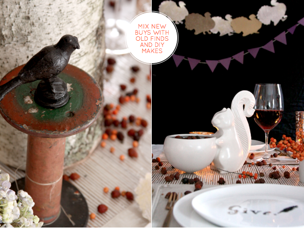
Styling and photography by Manvi Drona Hidalgo | Market Picks: 1 | 2 | 3 | 4 | 5 | 6 | 7 | 8 | Tabeltop resources: Gold votives | Gold triangle tumblers | Vintage spools | Squirrel | Sliver placemats | Metallic thread placemats | Napkins | Table runner | Flatware | Dessert plates | Iron blackbird
The lovely Manvi is back with her second column in the Tablescape 101 series, this time sharing her ideas and inspirations for a Thanksgiving tabletop. For those of us who aren't in the States or don't celebrate the holiday, there are still fantastic ideas for throwing a natural and rustic-inspired dinner party. After all, what better excuse to gather with friends than to say thanks for the people and things we appreciate? Take it away, Manvi!

I wanted to create a Rustic Glam table that reflected a festive fusion of nature, colour and shine, which I hope will inspire ideas for the dinner table as well as buffet tables, which are very practical on Thanksgiving. To create the centrepiece, I used birch barks from my local flower warehouse, which I wrapped around tall clear cylinders before filling one with tall branches of seasonal berries and the other with tea lights. The effect was magical as the soft glow of the tealights accentuated the colour of the berries. This was then tied into the rest of the scheme by adding smaller branches in assorted stemware, teacups and votives across the rest of the table, alongside large, vintage spools upon which I placed pies and pillar candles. Amongst these extra elements I scattered dried Rosehips scented with Blue Spruce Oil to bring festive fragrance to the table. You can easily make a 'Give Thanks' banner by using an alphabet template to make letters from from textured card; once the letters are cut out, cover them in old book pages and a layer of glitter glue, then hang from bakers twine. Finally, complete the table by serving a signature cocktail, Spiced Prosecco Mix. To make, place one teaspoon of hazelnut syrup, one teaspoon pumpkin spice syrup, ¼ teaspoon cinnamon into each champagne flute and top up with chilled prosseco to serve. Then all that's left to do is toast to those we love! - Manvi
Related Posts with Thumbnails
window.location.href="http://www.brightbazaarblog.com/";