Mr. Bazaar on Instagram!

COPYRIGHT © 2009 - 2012 BRIGHT.BAZAAR

Thursday, 31 March 2011

IKEA PRANT - DIY Modular Storage

A few weeks ago they charmed my socks off with their makeover of the RAST chest of drawers; this week the DIY spotlight is on the PRANT box. The team at Livet Hemma used a collection of the PRANT boxes to create a modular storage system, fixing them together with stationery clamps and painting the insides with soft pastel hues. I think it looks brilliant! Have you ever done something similar?

Wednesday, 30 March 2011

Mid Century Modern Living Room

Lately my love for mid century modern furniture has stepped up a notch and I've been trying to find out what triggered my higher than normal levels of Mid Cent Lust. Eventually I came back to this delightful living space. Since I pinned it to my Pinterest account a few weeks ago I've had it on the mind: the mustard yellow sofa, art wall, mid century pieces and lashings of natural light have me weak at the knees every time. What do you like about this space?

Tuesday, 29 March 2011

The White Company: Spring/Summer 2011 Collection

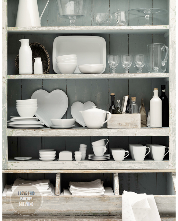
The latest collection from The White Company offers a range of gorgeous neutrals and white hues that are perfect for summer entertaining. As a fan of brights I'm always keen to mix in some crisp white shades to refresh my more punchy hues - The White Company is my first stop for such pieces. They've styled their spring/summer 2011 offering to great effect - just check out those bedrooms! I really like that well stocked pantry and wooden box organiser; what pieces do you like?

Monday, 28 March 2011

10 Things I Learned & Loved This Weekend

1. The subway tiles in this Italian deli caught my eye.
2. Saluting the long-awaiting sunshine on Sunday afternoon!
3. The sound of running water is incredibly relaxing.
4. Loved how the tiles meet the floorboards in the Italian deli.
5. I was excited to win these typewriter gift tags.
6. Stylist magazine ran a great story on outdoor spaces in the city.
7. I'm totally addicted to anything San Pellegrino-related!
8. A brilliant cover by GQ magazine.
9. Still crushing on this bedspread from Habitat.
10. Loved this yellow belt from Zara.

Sunday, 27 March 2011

Sunday's Bright Links No.28

1 | 2 | 3
A lovely round up of pieces from the latest Lisa Stickley collection.
Great fusion of indoor-outdoor spaces in this home.
Great tips on flower arranging from frolic's Chelsea Fuss.
Wanderlust: Around the World in 2,000 pictures.
Beautiful photographs from a weekend in Palm Springs.
The Snow Blind series by photographer Matthias Heiderich.
Stop motion video never gets old. This rue and kate spade venture is great fun.
Happy to see all these stripes.
This news made me walk to work with a smile on Thursday - congratulations, Mia!
Find out why I love France.

Saturday, 26 March 2011

Happy Weekend

We made it to the weekend, folks! Next week we move out of our friend's spare room and into our own place, so this weekend I'm going to be planning paint schemes - I love the calming, restful palette of this kitchen space by west elm. What do you have planned for your weekend?

Friday, 25 March 2011

Country Homes & Interiors, April 2011

When the lovely Rhoda, who edits Country Homes & Interiors and authors the blog, Countrydays, wrote about the April issue having a brand new look I couldn't wait to pick up a copy. The issue doesn't disappoint, with a refreshed design and considered features it holds interest and inspires throughout. My favourite tears from the issue include the whimsical shepherd's hut, the crafty ideas from the piece on adding personal touches to linens, tablescapes and vases, and the gorgeous food styling seen in the Good Food Good Times feature. If you can buy an issue, I'd highly recommend it.

Thursday, 24 March 2011

Bright and Rustic Dining Room

1 via 2
Last week I shared a pretty much perfect living room - this week it's all about this bright, bold and gently rustic dining space. Of course the turquoise table goes along way to winning my colour loving heart, but the mismatched chairs and bold patterned fabrics on the cushion pads also play a big part. Whilst it may be everywhere, I still don't mind the Knappa pendant from IKEA - it's affordable and looks great, which is a winner in my book! Meanwhile, artwork propped up against the wall and the bursting magazine holder create a relaxed feel to the space.

Wednesday, 23 March 2011

Home Tour - Inside The Home of a Finnish Stylist

Dwell have pulled a corker out the bag with one of their latest home tours. The space belongs to Stylist, Susanna Vento and is a veritable treat of whites and brights. One of the standout details for me are the paint dipped dining chairs, which lift the predominately black and white scheme. There's also plenty of other small, delicate details that add interest to the space, namely the softly accessorised windowsills and impromptu art walls. What do you like about Susanna's home?
Dwell | Photography, Petra Bindel

Tuesday, 22 March 2011

West Elm - High Summer Collection 2011

Hurrah! The summer 2011 collection from west elm is finally here and includes a divine mix of tabletop and textiles, as well as a newly launched west elm Kitchen range. The collection features three collaborators including David Stark (Mediterranean inspired entertaining), Lourdes Sanchez (pillows and prints) and Stray Dog Designs (paper-mache accessories and lighting). Whilst I do love their new kitchen range and Sanchez's sea life inspired pillows, especially the whale design, it's David Stark's work that stands out for me. I like Stark's philosophy of taking ordinary items and turning them into extraordinary pieces and was interested to learn that he is a classically trained painter. This skill is apparent in his watercolour tableware, which sits alongside the flowers he made from canvas. What stands out for you from west elm's summer 2011 collection?
Related Posts with Thumbnails
window.location.href="http://www.brightbazaarblog.com/";