Mr. Bazaar on Instagram!

COPYRIGHT © 2009 - 2012 BRIGHT.BAZAAR
Showing posts with label Kitchen. Show all posts

Wednesday, 28 November 2012

Holiday Decorating In Mr. Bazaar's Kitchen

Remember how I talked about this West Elm kitchen inspiring my holiday decorating last weekend? Well, I took heed of my inspirations and decided to bring some festive cheer into my own kitchen. I swapped out some of the non-holiday pieces (shared here last month) on my freestanding kitchen unit for some quintessential Christmas finds. I've not reinvented the holiday decorating wheel here, but simply stuck to the tried and tested classics for the season: think candy candy red and white stripes, playful polka dots and whimsical Scandi touches. For me Christmas is the time of year we can all embrace the kid within us, after all wasn't it the most magical time of year when you were growing up? With this in mind I always try to include some charming youthful touches to my decorating, hence the lovely Pixie I bought in Copenhagen. (In fact, a friend I was travelling with joked that I had to buy it because I had worn nothing but an array of fairisle jumpers for the whole trip!) That said, I've still kept the look practical because this is a working space. With minimal foliage and no lights, I used everyday items from within the red palette and stripe or polka dot patterns to create a cohesive look. Meanwhile, leaving free space in the centre means I can still use the surface for food preparation. I'm smitten with how this corner of my kitchen has turned out! What do you think, friends?
// Styling & photography by Will Taylor

Saturday, 24 November 2012

Happy Weekend: Festive Red Kitchen

As there's only a week to go until December hits I'm well and truly feeling the festive spirit! I normally don't start decorating my place until the 1st December, but I'm not sure I can resist taking a walk through the woods this weekend to pick up some festive foliage to start placing around the apartment. Truth be told, I don't know why I'm even pretending that this might not happen because I even tried to get some winter berries from my local florist last weekend, but I was too early! What can I say? Mr. Bazaar loves the festive season! Whilst I can realistically bring smaller decorative pieces into my home, I don't have space for this beautiful SMEG fridge I spotted over at West Elm, but that won't stop me dreaming - isn't it fab? In fact, the whole kitchen space it's styled in is rather dreamy. I have very similar storage unit to this, except in black metal, and it's given me some styling ideas to try out over the weekend. How about your weekend? Will you be doing anything fun and festive? Have a lovely one, friends!
// West Elm

Thursday, 15 November 2012

Colour Palette: Rustic Kitchen Diner

If I ever need reminding of just how powerful colour can be in an interior space, then this would be the room to do it. Why? Well, take a moment to imagine this space without the weathered green factory pendant or the rustic blue stool and rug. Without them, I believe the space would be lifeless and seriously lacking in depth. The green pendant provides a visual break between the pale wooden dining furniture and the white cabinetry behind; this is important addition because it brings depth, while also drawing the eye down to the focal point of the room. Meanwhile, the texture and colour added through the blue Tolix stool and rug bring warmth to the milky white base palette. I love the subtle addition of purple through the blooms, too - green and purple are such a great combination! What do you like about this space?
// Skona Hem

Wednesday, 31 October 2012

How To Add Character To A Kitchen

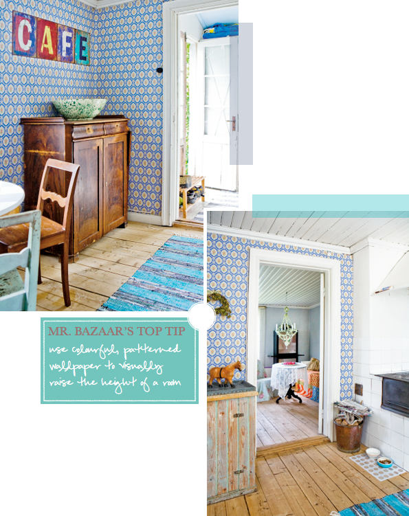
When decorating with colour it's important to consider texture and pattern alongside your choices of hue. Think about the elements of the space and what you wish to draw attention to (or try to disguise!) as the answers will help you formulate the vision for your space. In this kitchen we can see how a boldly patterned wallpaper has been used to visually 'open' the space by appearing to raise the height of the room. By papering the three adjacent walls to the galley-style kitchen, it effectively draws the rest of the space together, zoning it as the 'kitchen' and making it feel like a much larger space than it really is. The character and charm of the wooden floor boards are echoed in the rustic, weathered kitchen cabinets, which have been painted in a series of turquoise blue shades, then distressed. For me, this addition of colour and texture is what makes this kitchen is a real winner. What do you like about it, folks?
// Hus & Hem | Photography by Kent Bill Qvist

Friday, 26 October 2012

Using Colour To Soften An Industrial Kitchen Look

1 | 2 | 3 | 4 | 5 | 6 | 7 | 8 | 9
The fusion of industrial and country style has to be one of my favourite looks of the moment. I love the main colour combination of rich noir and racing green in this kitchen. Peppering primary blue and red accents throughout the space has helped to keep it feeling fresh and modern; a much needed hit of vibrancy to the industrial elements. The ticking stripe fabric that has been used to cover the front of the kitchen units adds a relaxed country charm, which in turn also softens the more robust elements of the scheme, such as the black walls and industrial-style metal stools. Sometimes I see a space that wholeheartedly encompasses my vision of Bright.Bazaar style, and this kitchen, with it's bold use of colour, is one of those spaces. Tell me, what are your favourite elements of this kitchen?
// Ideal Home | Photography by Simon Whitmore

Thursday, 11 October 2012

Colourful & Eclectic Brazilian Kitchen

Given Rio de Janeiro is known for its vibrant party culture, I think this kitchen could easily win the Quintessential Carnival Rio-Style Kitchen award - well, if such a prize existed! Thanks to its colourful and playful design, the space feels energising and upbeat - and there are plenty of interesting design points to take away, too. There are two key elements that help create the eclectic, relaxed feel: firstly the mix and match tiles used for the kitchen splashback, and, secondly, by using chairs differing in design and colour around the table. The third element, the tartan wallpaper, is slightly left-of-field - I think all spaces need one surprise feature - but works wonders in the room, zoning the breakfast nook into it's own 'area' but connecting it to the kitchen thanks to the cross-referenced colour palette. Should Mr. Bazaar find himself in Rio, he would be very happy to try out some of the local dishes in this kitchen! What elements of this kitchen do you like?
// Casa Brazil | Photography by André Nazareth


Wednesday, 10 October 2012

Mr. Bazaar's Retro Kitchen Barber Board!

Welcome, friends, to a little peek inside Mr. Bazaar's kitchen! Are you wearing spots or stripes today? If you are, cocktails are on me; that's the deal! Isn't my new retro barber board fun? I like to have a little fun with the interior of my home, so I wasn't surprised when I was immediately drawn to the playful and unusual feel of this piece from Rose & Grey. It reminded me of the boards you see in small barber shops or above the counter in a burger joint. I think it works really well with the yellow accents in my kitchen, especially after I made over my kitchen cupboards with yellow vinyl last weekend. I'm really happy with it as it pulls together the items upon my freestanding kitchen unit a treat! What do you think, folks?
// Photography by Will Taylor

Thursday, 20 September 2012

Colour Palette: Making Yellow Work In The Kitchen

It's no secret that I'm a fan of yellow but this kitchen is bananas (no pun intended)! I would love to wake up and come downstairs for my first cup of coffee of the day here. Cripes, even washing up at that sink (with the no doubt beautiful view) would make the chore that much more bearable. I'm especially inspired by this space because yellow is difficult to get right in the kitchen. The use of the colour works here because a matt finish has been chosen, which prevents the finished look from feeling juvenile. Plus, notice how the yellow has been paired with rich purple accents and charcoal grey worktops that temper the brighter yellow hue. I also like how there's a mix of storage units; by having one open unit it keeps the kitchen from feeling too formal or stuffy. What do you like about this kitchen?
// Better Homes & Gardens

Thursday, 6 September 2012

Date Night! Three Stylish Kitchen Couples

Thursday's arrival means it's blind date night, so kitchens and their perspective accessory dates are busy prepping themselves for another round of kitchen speed dating - and they're all vying to be a date to your dinner party! The question is: who will get your coveted invite? Couple number one are a multicoloured, ex-city dweller turned country bumpkin duo with a new found love for the simple things in life. The open shelves display their vintage finds curated from city flea markets of years gone by; brightly coloured fabric and accessories reflect their new, softer surroundings. This vibrant and dynamic duo are fizzing with enthusiasm and energy! Up next is kitchen couple number two, who are calmer than their multicoloured counterparts preferring to live a simpler, uncluttered lifestyle. Solid wooden pieces are teamed with retro finds reflecting the couple's comfortable and long lasting relationship. Your final choice is kitchen couple number three. These two are like peas in a pod, their mint hues bonding them from the moment they met. Safe, refreshing and fashionably 'on trend', they'll make for great guests. So, three very different, yet very stylish kitchen couples to choose from - your task is to choose who gets your invite?

Friday, 31 August 2012

Kitchen Brights: Pick Your Hue!

For years I've been left frustrated when shopping for small kitchen appliances. You know the ones I mean: those appliances that resemble a lump of steel or have a cheap white finish. So you can imagine Mr. Bazaar's delight when he happened upon the Kenwood kMix range of kitchen electricals, a collection of colour block brights for your kitchen that could easily have been commissioned by Mr. B himself! (Also check out their Barcelona food mixer - talk about love at first sight!) The moment I saw the range I knew it contained ideal pieces to use as accent pieces to a pared back or simple colour palette. Take the first kitchen as an example, where tomato red accents have been used across the electricals and utensils to add interest and warmth to the otherwise clinical and industrial space. By sticking to one accent colour the resulting scheme feels consistent and visually balanced. Yet don't be fooled by these clever brights because they earn their keep beyond a standard white kitchen, as seen in the second kitchen unit where pink and orange accent pieces create a sophisticated yet playful palette. For my Bright.Bazaar kitchen I'm opting for the yellow colourway but which colour would you pick to brighten your kitchen, friends?
// Kitchen photography by Tim Young for Ideal Home | Shelving via Ideal Home | Animation by Will Taylor for Bright.Bazaar 

Thursday, 23 August 2012

Kitchen Notebook: A Green & Black Beauty

ONE / TWO / THREE / FOUR / FIVE / SIX / SEVEN
I've always felt a strong connection to the kitchen. Yes, I love to eat(!) but it goes deeper than culinary pleasures and stems back to happy childhood memories. When I was little my mum and I used to stand side-by-side baking for hours on end. We'd bake cakes, cookies, biscuits and lots more; I'd watch mum first and then make my own much less fancy version, but it was still a whole lot of fun. These days when I'm at home I'm often found in my kitchen, whether it's enjoying the peace of dawn with my first coffee before a new day kicks in, cooking up a dish for dinner or working away on my laptop. I'm no minimalist so that cosy, lived-in feel that one often feels in the kitchen thanks to the abundance of pots, pans, utensils and foodie bits, makes me instantly feel like I'm home. That's why the kitchen space of Austinites Marco Rini and Tim Cuppett resonated so strongly with me. The open wall storage and little nooks filled with linen-packed baskets makes for a practical and cosy kitchen that oozes personality. Plus, the olive green and black colour scheme works a treat with the raspberry red accents - delicious! What do you like about this kitchen? Do you have happy kitchen memories?
// Photography by Alec Hemer for Country Living

Wednesday, 15 August 2012

Our Workshop Kitchen Accessories

How adorable is the new Bliss in the Woods homeware collection from Our Workshop? The moment I noticed the owl spaghetti jar I was sold - so cute, right? I'm thinking if I treat myself to it I'll have to get the Salt Bird/Pig to keep him company. In fact, it would be hard for me not to buy up most of the collection because I really like the use of colour in all the pieces. I think the balance between form, function and playfulness is spot on. Anything catching your eye, folks?
// Our Workshop

Friday, 29 June 2012

A Colourful Swedish Fabric Collection

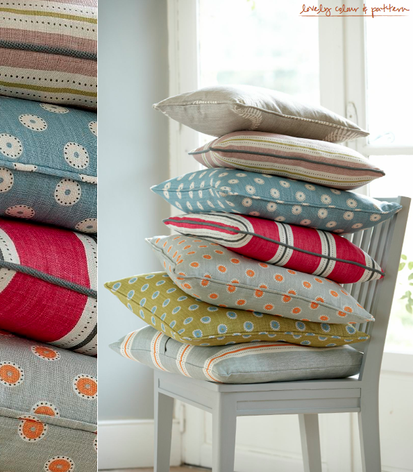
Vanessa Arbuthnott's Swedish collection draws inspiration from some of the iconic British designers of the 1950's - but with a subtle Scandinavian twist. The four new designs depict stylised birds and foliage in new Gustavian shades such as Dove and Dusky Pink and some bright contemporary colours, Pumpkin and Sweet Pea with a spot and a striped design as co-ordinates. The Pretty Maids fabric in Duck Egg, Pumpkin and Winter colourway is hands down my favourite, but Stockholm Stripe in Sweet Pea and Winter is a close second. Congratulations to Vanessa on her 10th fabric collection: one full of wonderful colour and pattern. A big thumbs up from Mr. Bazaar!
// Vanessa Arbuthnott

Tuesday, 29 May 2012

Colourful London Warehouse Kitchen

This kitchen and dining area is part of a home in Hackney, East London, an area which has steadily been increasing in both popularity and gentrification across the last ten years. The owners, artist Francis Upritchard and her husband furniture designer Martino Gamper have gradually added to the space during the six years that they've been living there. The flat is actually part of a ex-Council (public housing) block but you'd never know given the warehouse feel and beautiful windows within the space. The kitchen details a palette of rustic browns, fresh greens, Prussian blue and bright yellow and orange. Upon the floor rugs from Morocco continue the colourful theme, adding warmth and texture as they do. My personal standout piece? Without a doubt it has to be the colourful cabinetry. But in all honesty, this whole space is packed with personality, colour, texture and warmth, all of which are key features to making a winning space. What do you like about this kitchen space?
// NY Times magazine | Photography: Tom Mannion

Tuesday, 22 May 2012

Colour Palette: Kitchen Colour Block

Sometimes with colour it's best not to over think things. Instead, just pick a few of your favourite hues and  dive on into your colour journey. Despite its bright hues this kitchen maintains an air of simplicity because the colour is applied in a colour block style. Two shades of orange are teamed with a matt pink (those two are like best buds!) and the fresh yellow breaks the flow, stopping the scheme from feeling too forced. I love this stylish yet bold use of colour. Isn't it wonderful how much personality and pizazz colour can add to a space?!
// Photography by Jean-Marc Wullschleger | Living Agency for Real Living

Wednesday, 2 May 2012

Colour Palette: Muted Mint Kitchen

This post is a partnered post brought to you in conjunction with Churchill Home Insurance who offer reliable home contents insurance.
Before we go anywhere may I please just wax lyrical about the stunning space for a moment? I love it! This is what Bright.Bazaar is all about: spaces that use colour to take them to the next level. Personally, I believe that this kitchen is yards more interesting than it would be if it were decorated without the muted mint shades. Why? The washed-out mint hues add interest to the grey marble and whitewashed floorboards and walls, which gives the space added visual depth. The row of theatre-style bulb lights brings a dash of drama, whilst the bare wood keeps the scheme feeling organic, tactile and warm. The darker green accent hue on the Austrian Cafe Bentwood chair serves as a focal point amongst the array of soft shades. What do you like about this kitchen?
// Photographs by Petra Bindel for Elle Interior Sweden

Friday, 17 February 2012

Trend: Kitchen Pastels

Lifestyles: Jme | Market Picks: 1 | 2 | 3 | 4 | 5 | 6
Pastels are experiencing a renaissance of sorts in the world of interiors, with many brands - both High Street and luxury - adding more than a gentle nod to the soft colourful shades in their current collections. As such sorbet hues are no longer tied to children's bedrooms, instead they are claiming a stake across products for living and dining as well. That said, it's the kitchen where the trend is most noticeable this season and, potentially, one of the easiest spaces to work the sweet as sugar shades. You could opt for sky blue walls with dusty pink accent in your tablecloth, or swap out the pink hue for a primrose yellow to take off the feminine edge. Have you decorated with pastel hues? How do you like to decorate with these shades?
Related Posts with Thumbnails
window.location.href="http://www.brightbazaarblog.com/";