I saw this huge brownstone image on made by girl's lovely blog last week and I haven't stopped thinking about it since. It's on the wall inside Coisas da Doris' store, but I can't see it online. Does anyone know where it's from, or, where I can find something similar? I love it and think it would look perfect in our new living room because there's a big white wall that needs filling asap!
Wednesday, 30 June 2010
{Rustic Kitchen/Diner: Get The Look}
This is the kind of place I'd like to spend a couple of weeks on holiday. It would be perfect for whipping up a green salad, some fresh bread and a good glass or two of wine for one of those lazy European lunches on the terrace. Ok, so I'm dreaming, but I do love this space. I wouldn't choose to live in it full time, but it certainly fits that summery/laid back/chilled/generally-super-douper-happy kinda mood I usually have when chilling out on holiday. Geee, those tiles are killing me!
Tuesday, 29 June 2010
{Before & After: Traditional Meets Modern}
Ah, those talented lot over at Elle Decor never let us down on the old inspiration front, do they? They've pulled it out the bag again with one of their latest online articles, which details the remodel of Monticello, the country house of Thomas Jefferson. Reffering to the bright and bold new shade of yellow that graces the grand dining room walls as 'chrome-yellow', and coupled with some interesting facts, the full article makes for a worthy read. You can check out the full image gallery, too. I loved the vibrant grandeur look that follows the efforts of the remodel; the space seems bigger and, well, less drab and more fab.
Before
After
Elle Decor article written by Mitchell Owens | Photography by Pieter Estersohn | Produced by Charlotte Moss | These layouts by Bright.Bazaar
Monday, 28 June 2010
{10 Things I Learned This Weekend...}
1. My new kitchen clock looks ace (but was a nightmare to hang!).
2. I spent an hour or two with many, many black frames (More details soon...).
3. Three of these pendant shades now hang proudly in our apartment.
4. I had a wonderful night with friends in a comedy club called 'glee'.
5. Upgraded my Mac to Snow Leopard, which rocks.
6. This wallpaper was in a bar I popped into and it really caught my eye.
7. My great and all round fabulous friend, Hannah, leaves for a year in Australia tomorrow - have a blast hun x
8. My number one vice when it's this hot.
9. New orange bed linen is fun!
10. Beautiful.
Friday, 25 June 2010
{Colour Cocktail: Pink and Orange}
This week two of the world's pop colour heavy weights join forces to make a cocktail so strong it could blow the roof of the house off. Ok, not really, but these are two very bright and very determined colours. Pairing them up should spell disaster, but done right these two vibrant personalities don't clash. In fact, they get on pretty damn well. And anything that featured in Domino is our friend, right? Thought so! Thanks for another fun week, friends. Have a fantabulous weekend and I can't wait to see you back here on Monday. x
{A Bridgehampton Farmhouse}
As well as Lonny I also love to peruse Laura Day Living during my down time. Now in it's third issue, Laura Day Living is delivered to our screens bi-monthly and is all about making rooms for living. The latest issue is all about summer and as the weather has been so good this week - amazing, considering it normally pours with rain when Wimbledon is on! - I thought it would be perfect to share this inspiring home tour of Laura's Bridgehampton Farmhouse. In the issue Laura shares her tips on designing for, and living with, kids. Now, kids or not, this is a great space...I might just have to move into that industrial kitchen (8) and whilst we're at it, the front aspect (1) isn't half bad either, right?!
Thursday, 24 June 2010
{Rice: Fall Collection 2010}
I'm a huge fan of the fall season; the orange hues of the leaves, roaring fires and the more adventurous clothing fashions compared to the more predictable trends of spring/summer. It's not only in fashion collections where I feel fall designs are more interesting than s/s, it's for interior brands as well. Rice is no exception as this feast of warm brights and maximalist ideas demonstrates. My top three favourites have to be the inviting textiles, poppy melamine pieces and the multi coloured cooking pans. What would you choose from their new collection to brighten up your place?
Images: Rice
{Bright Blooms #7}
Now I'm getting settled into the new place I've had time to do relax and try out some more arrangements. This week I've gone for a contrasting visual: vibrant yellow roses, softened with some white stems, held proudly upright by a tall and sleek black gloss vase. This really brings my living room to life!
Images & Layout: Bright.Bazaar
Wednesday, 23 June 2010
{Kitchen Dreaming}
Ok, so which kitchen would you choose?
Shaker-style with a hint of industrial flavour
Chic concrete floor, stainless steel cooker hood, open storage and reclaimed dining furniture
Country-style meets rustic glamour
Curvaceous bar stools, soft and feminine lighting, glamorous gold mirrors and exposed brick walls
{I'm moving in...}
Tuesday, 22 June 2010
{Teal}
Until I started researching for this post I had never held Teal in a high regard. This wasn't purposeful, rather I just felt drawn to other hues more regularly. Well, I now consider myself fully converted because this set of images shows that it's an incredibly versatile colourway. From the insides of kitchen cupboards (1) and rustic shutters (3) to the anchor accent in a heavily patterned scheme (6) and then mixed in with a variety of other colours (7). Not bad, hey? My favourite has to be the kitchen cupboards option - simple but effective. Which is yours?
{Debi Treloar Photography}
Admiring the talent of other creative souls is one of my main inspirations; I can't fail to be inspired by the great work of a stylist, photographer, artist or designer. Heck, even good cinematography gets my creativity all a flow. Sometimes this can be overwhelming because I feel awash with inspiring ideas and thoughts, but nine times out of ten, it's a good thing. This past weekend I went to check out Debi Treloar's portfolio after being impressed with her photography work in Bazaar Style by Selina Lake. I loved what I saw, especially some of the bright bursts of summary hues and warming, Moroccan-flavoured locations. Yum. Please have a peek at her portfolio; there's photography of food, interiors, lifestyle and more...you can easily loose an hour or two over there. Of course, my total fave is the vignette (2) of pop vases and sky blue wall (I'd love this in my hallway). Which one of these is your fave?
Images: Debi Treloar
Monday, 21 June 2010
{Retro Kitchen: Get The Look}
I don't know where to start with this fun and fabulous space; for me it's all so good. It's an eclectic and colourful space tied together with industrial metal finishes and soft, neutral furniture, which makes me want to call my buddies and get together for an impromptu evening of good food and wine. That mantle is pretty much my ideal mantle and don't get me started on how excited I am by those open kitchen shelves. Plus, that hugely European stone floor...I die! Right, time to stop being all swoonful and see how to recreate this playful kitchen space...
{10 Things I Learned This Weekend...}
2. This chandelier is lots of fun.
3. Loved the creativity of this small space shown on the cover of Apartment Therapy's Big Book of Small, Cool Spaces.
4. Vintage phones. What's not to love?
5. As my friend Han would say, I 'debuted' my new Reiss shoes and loved wearing them.
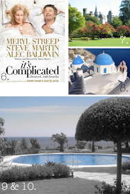
6. Watched It's Complicated on DVD. Still love it.
7. Ran around the park in the glorious sunshine. Bliss.
8. Lucky enough to be travelling to Oira or Santorini this summer? Then, check this great guide out.
9. I was relaxing by this pool almost exactly a year ago to the day.
10. Sigh. So pretty.
Friday, 18 June 2010
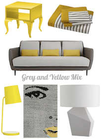
{Colour Cocktail: Grey and Yellow}
I've felt quite inspired by masculine-meeting-feminine spaces this week; from the sophisticated and colourful designs of Nate Berkus, to the fun my style challenge ran by Ally. So, I decided to make this week's colour cocktail on a combo that worked perfectly in such spaces. I love both of these shades - on their own or as a combo, but the latter really helps to bring each partner alive. Don't you think the grey makes the yellow pop and the yellow makes the grey look deep, thoughtful and comforting? This is the kinda colour cocktail you'd expect to see in a high-end Manhattan hotel with a room over looking the park and the glistening lights and yellow cabs below acting as an extension of the scheme. I'm going to dream of this over the weekend...whatever you do, I hope you have a great time and see you next week. x


.png)


