Little Brown Pen is such a fun blog! I've just discovered it and can't get enough. Authored by Nichole Robertson, it celebrates her love for exploring details through photography. Much of the images Nichole shares are from Paris, like these gorgeous ones focused around the colour red. These simple images have me itching to crack out the paint charts and inject some vibrant reds into my flat. I know what I'll be doing this weekend...!
Friday, 26 February 2010
Thursday, 25 February 2010
{Holly Jolliffe photography}
My Mum has a serious addiction to recipe books (sorry, Mum!) and for as long as I can remember her kitchen has been bursting at the seems with them. It certainly makes present shopping easy as I know she will always love a recipe book, but secretly, I'm also quite a fan of them for gaining inspiration. Be it the colourful, vibrant and cultural themes from the pages of Jamie Magazine, or the delicate, yet indulgent imagery from a Nigella book, I always find something that inspires me. The rich red of a pudding or the crackling of hot caramel - so many times the colour of one of my rooms has come from a recipe book. I think styling and photography for food and interiors often go hand-in-hand and boy do they make for some gorgeous imagery. Holly Jolliffe's photography is no exception and her online portfolio is perfect for escaping into for a dreamy five minutes.
Images: Holly Jolliffe
Wednesday, 24 February 2010
{Accessorising with flowers}
On my recent trip to Paris I suddenly realised that there was one area of interiors I had been overlooking: flowers. Of course, I've appreciated floral fabrics, prints and the such like within home interiors before, but I've always over looked a simple display of blooms. Whilst I was in Paris, my eyes kept being drawn to tiny little florists. My favourite was this one:
I loved it because it wasn't big and grand, or clinical and corporate like some of the major players can be. Instead, it felt homespun and welcoming; even the door slightly ajar despite the freezing weather says, 'come on in and say hello'. The delightful store became even more magical by night, all the twigs above the entrance gently twinkled with a soft, white glow and simple window displays were bathed in a moon-like light.
Thinking over my trip as I travelled back on the Eurostar, I felt excited that I had discovered a new found interest in this part of interiors. I've been on a search for some more inspiration...
Holly Becker from Decor8 has worked up some seriously gorgeous styling with this Heather. A pop of vibrant green tissue paper offsets the purple hues brilliantly.
I've spent what must have been hours drooling over the Terrain website. Part of the Urban Outfitters and Anthropologie family, this cracking US chain hopes to bring people and flowers together. I've made a pact with myself to visit one of their stores on my next visit to the states. I hear they do great food in their cafes, too!
Images: Parisian Florist by Will Taylor for Bright.Bazaar; Heather from Decor8's photostream; square screen grabs from Terrain.
Tuesday, 23 February 2010
{High-gloss in the kitchen}
Yesterday's post about the high-gloss walls in designer Miles Redd's Manhattan home left me wanting more. I soon found out that Miles definitely isn't afraid of using colour - just look at his kitchen! This is what I call being seriously brave; it's a tiny space but glossy green cabinets work really well and don't close the space in. That said, I'm not a huge fan of the green blind! Everything else, though, is a case study in how to use gloss units in a small kitchen. I'm impressed because this kitchen even makes me like the stainless steel in the worktops, which isn't usually my favourite material for a kitchen, so good work, Miles!
Monday, 22 February 2010
{High-gloss walls}
There's plenty of high gloss pieces in my home (ok, so high gloss is a little 2006, but I like them and that's what matters!). I have two of these Spindle lamps, one table and one floor sized for my living room, along with some glossy melamine bits and bobs in the kitchen. However, I hadn't considered high-gloss walls until I saw these images from House Beautiful on Style Sleuth's blog.
I like how the different textures and shapes of the room are gently reflected in the gloss of the wall.
The richness of the colours here are gorgeous and the pop of orange in the sofa adds interest and warmth to the scheme. The peep of wallpaper in the next room looks lovely, too!
Wednesday, 17 February 2010
{Home Tour: A bright Parisian apartment}
Over the last week, I've featured a collection of white, stark homes on Bright.Bazaar. There was that gorgeous white house, along with the cold, but super slick and stylish concrete homes on Monday's post. Despite not being my favourite interiors, I did manage to take some inspiration from them, but it was writing about Zach's Brooklyn apartment that reminded me why I started Bright.Bazaar back at the start of 2009: quite simply because I love colour and believe it allows us all to express ourselves inside our homes. I just find colour so uplifting and playful!
This Parisian apartment is a far cry from the small kitchen in Paris I wrote about a few weeks ago - both equally stylish, just for very different reasons. Talking in an interview with The Guardian, owner Mathilde Baralhe explains that she has had a lifelong love affair with bright shades (she's my kinda girl!). Cleverly, Mathilde kept all the walls, floors, mouldings and panelling neutral, whilst adding primary-coloured furniture to satisfy her desire for bright colours.
What works so well in Mathide's apartment is that, although it may not look like it, she hasn't gone wild with colour. Sticking to three colours - reds, yellows and blues - all the rooms are tied together and the bright colours become the story and the scheme running through her home. I love how she has added pops of colour to the backs of the floating box shelves; it makes what would be a fairly ordinary shelf, extraordinary!
Images: Antonie Baralhe
Lots of the latest homeware collections have jumped on board the trend for hot pinks and loud yellows, but what does colour mean to you? Do you like to add gentle hints in the form of pastel shades, or do you go for in-your-face, bold and brash brights?
Tuesday, 16 February 2010
{Interiors Inspiration: A tiny Brooklyn studio apartment}
I couldn't believe my eyes when I found the interior of Zach Motl, a junior designer at Robert Couturier & Associates, in the NY Times last week. At a tiny 178 square feet, Zach has made use of every inch of space in his eclectic studio apartment in Brooklyn.
Somehow even though Zach's belongings are stored on display, it doesn't make the space feel that small.
I don't know about you guys, but how he has made under-the-bed storage look stylish I don't know...but he has!
The utilitarian-chic of Zach's kitchen has just the right amount of industrial flavours, saved from being too cold by the deep and warming green of the wall. This striking colour also helps to zone the area, which is essential for one-room living.
Could this cut-out kitchen be any more adorable?! Loving the splash of colour in the form of the blue wellies and bright red bowl.
The use of neutral colours through-out the studio helps to tie the eclectic look together, and makes the introduction of colour (like with the green kitchen wall) that much more effective.
The midnight blue ceiling adds drama, whilst working with the white accessories to calm the space.
The splashes of both colour and graphic prints (as seen above) add interest and prove that despite having a small space, you don't have to cut back on stylish additions or pattern. I'd recommend reading the full NY Times article - it's really inspired me to get creative in my little flat!
Monday, 15 February 2010
{Interiors Inspiration: Concrete}
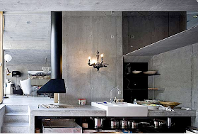
Much like the all-white house in Friday's post, I'm not too sure I could live in these overtly modern interiors, that I saw on Deco Fabulous. They are too set, and frankly too hard and too cold. Still, I can look past my personal interior preferences and recognise that these slick, masculine and high-end design interiors are very stylish - it's just that they're not me. That said, I have taken some inspiration from them: I love the white standard lamp and brightly coloured cushion in the first picture, plus the 'wire' light with the coloured shades above the table in the fifth image is an inspired light fitting. What are your thoughts on these concrete interiors?
Images: Deco Fabulous
Friday, 12 February 2010
{Home Tour: Would you like live here?}
Images: freshome
I'm not so sure that I would like to, but it's certainly pretty to look at. The things I do like? I love the log store, the big mirror leaning up against the wall in the bedroom and the kitchen/diner has a simple beauty to it, thanks to all the natural light and distressed wooden surfaces. So, would you like to live here?
{A stylish wall sticker}
Remember these gorgeous birdcages from last week? Well, I still can't get them out of my head, which is annoying because quite frankly I don't have space in my little flat to hang birdcages in an artistic/dreamy fashion. However, I have a plan! I discovered a quirky online interiors store yesterday called Illustrated Living. They stock some fun retro pieces and lots of accessories adorned with both prints and patterns - a great little place to pick up something to give a room the wow factor. Plus, they do birdcage wall stickers. Yes, I know - amazing! This solves the space problem in my flat: I can now have birdcages, without loosing any space. Perfect! If you head over to Illustrated living and see something you like, then come back and tell me what you're favourite product is - I'd love to know what you're loving at the moment. P.s. The blue colouring on the inside of the cabinet below is so stylish, I love how it provides a dramatic backdrop to the clear wine glasses.
Image: Illustrated Living
Thursday, 11 February 2010
{The brightest accessories}
Forget the weather forecasts, if we're to believe the new collections for SS10, then we're in for a scorcher come Summer! Everywhere I look for inspiration at the moment, I'm seeing stores positively bursting at the seems with brightly coloured, bold and in-your-face accessories, that could warm the coldest of interiors in an instant. Here's a pick of my favourites from the high street:
Above images: Habitat
Top to bottom: Balun vase, Regatta cushion, Tyler frame, Ivy hare decoration and Ivy owl decoration. All available from Habitat.
Above images: Rice
Above images: Heals
Top to bottom: Starburst orange silk cushion, Lsa Hula yellow vase, Diamantini & Domeniconi Arcoiris Stripe Cuckoo mantle clock. All from Heals.
My favourite is the Regatta cushion and the Ivy owl decoration from Habitat because I think they would remain stylish beyond one season. I can't get over how bright the stripe clock is from Heals - a statement piece for sure! Have you seen any bright accessories that you like recently?